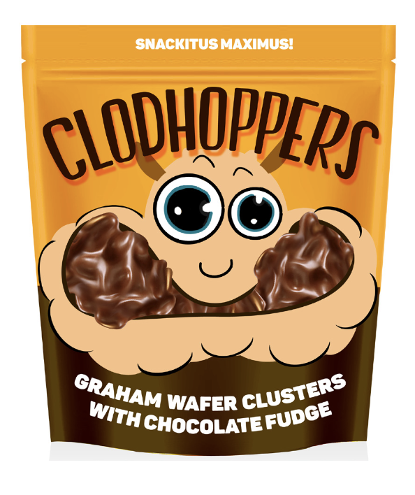
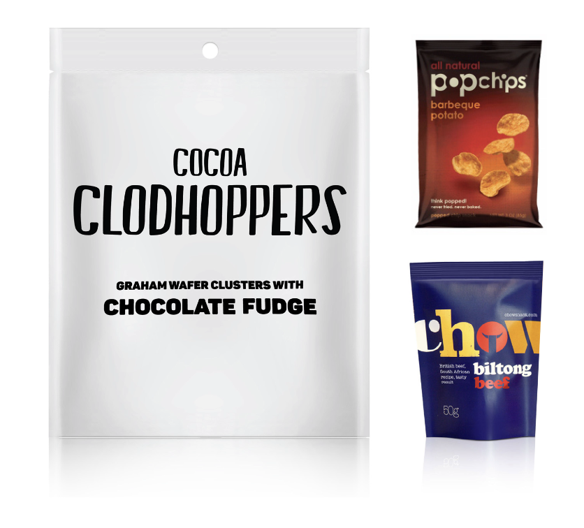
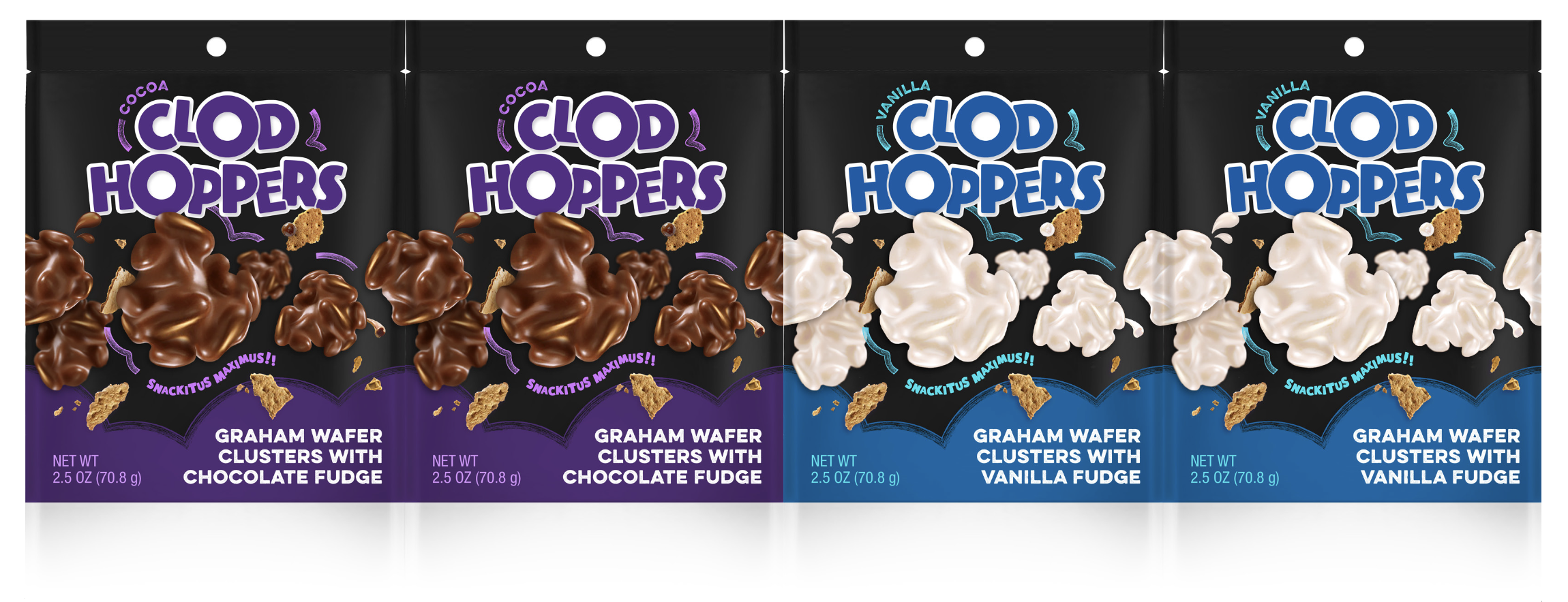
CLODHOPPERS | PACKAGING DESIGN
CLIENT: HERSHEY’S
ROLE
Packaging, Brand and Typography Designer
TOOLS
Adobe Illustrator and Photoshop
LENGTH
8 Months
COLLABORATORS
The Design Team at NiCE ltd.
PROJECT
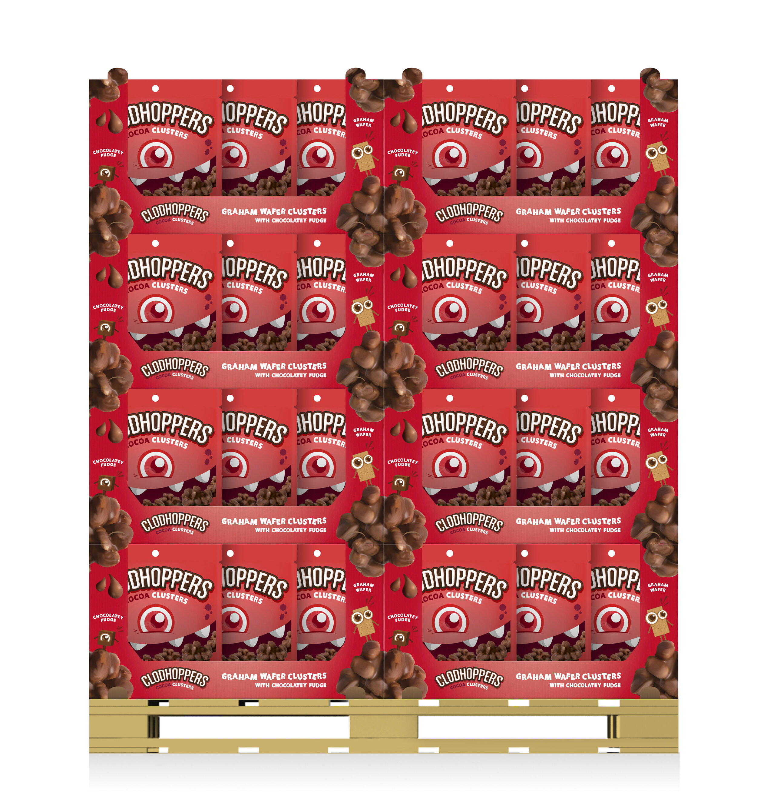
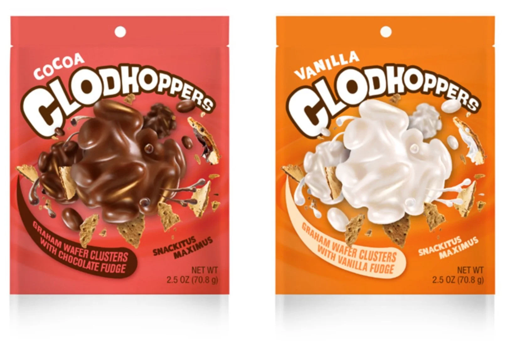
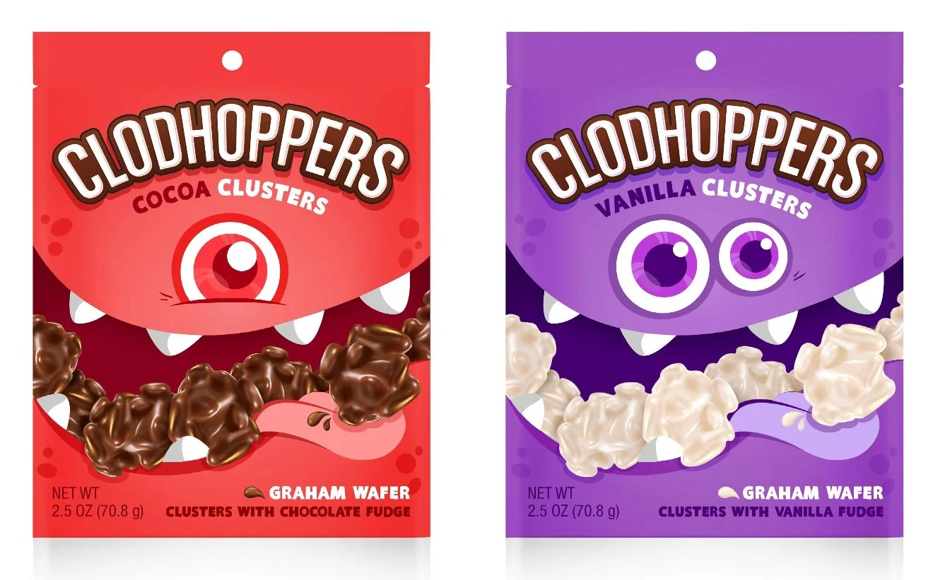
Clodhoppers is a super fun and quirky brand that needed a bit of a refresh to be put back on shelves at Discount and Dollar Stores. The product consists of graham wafer clusters covered in fudge.
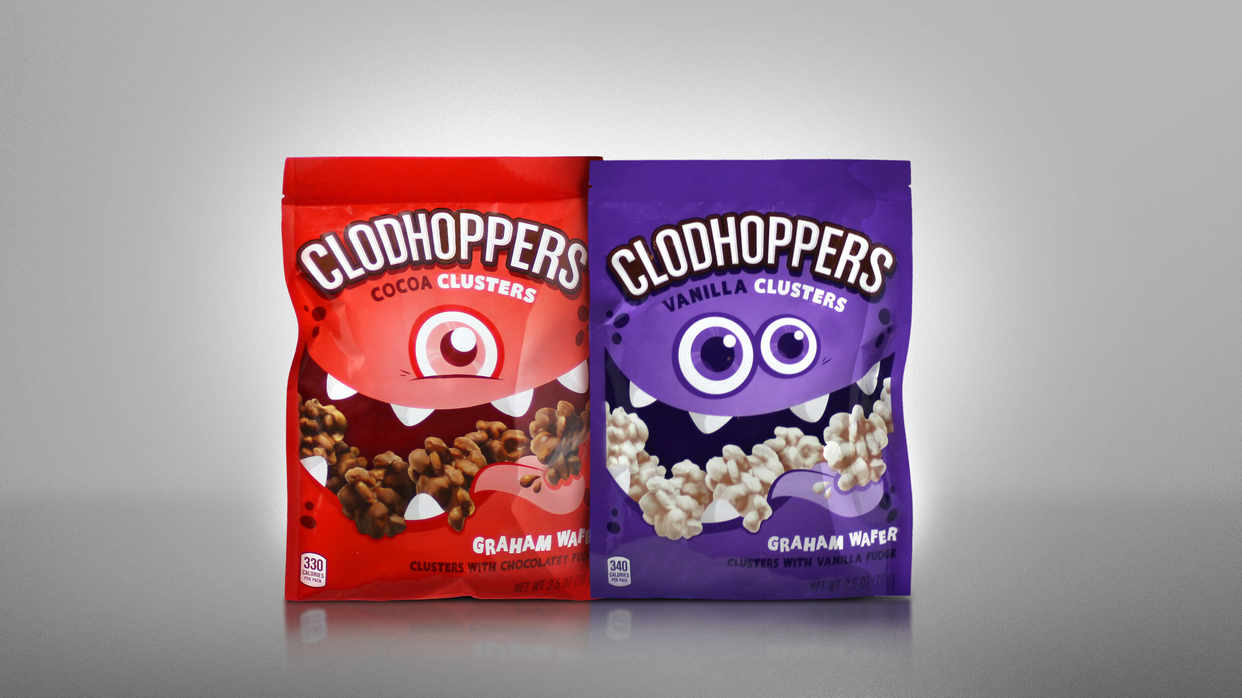
The team and I developed these packaging designs for their Chocolate and Vanilla lines to help the brand represent the product's personality better.


FRAMEWORK
• Research indicated ‘Clod Character’ and ‘Mad Batch’ designs have potential for market success.
• Due to the successful results, design exploration should resemble original elements that were tested.
• Results show the need for exploration of two directions:
The ‘Clod Character’ design should evolve to be more approachable & fun but not childish
A focus on heroing product and simplicity with an exploration of color and type
BUSINESS OBJECTIVES
• Position Clodhoppers in the “Munching Innovation” platform
• Use packaging as the sole communication vehicle for shoppers
• Capture new occasions from other snacking segments
• Consider a flexible design for pack adaptation and flavor versioning

MAD BATCH EQUITY | REFERENCE
To reserve equity for Mad Batch product development, design considerations include:
AVOID
Deep jewel tone color palette
Handwritten type styles
Capture new occasions from other snacking segments
‘Explosive’ product visual stories
BUILD
• Product focused design
• Expressive typography
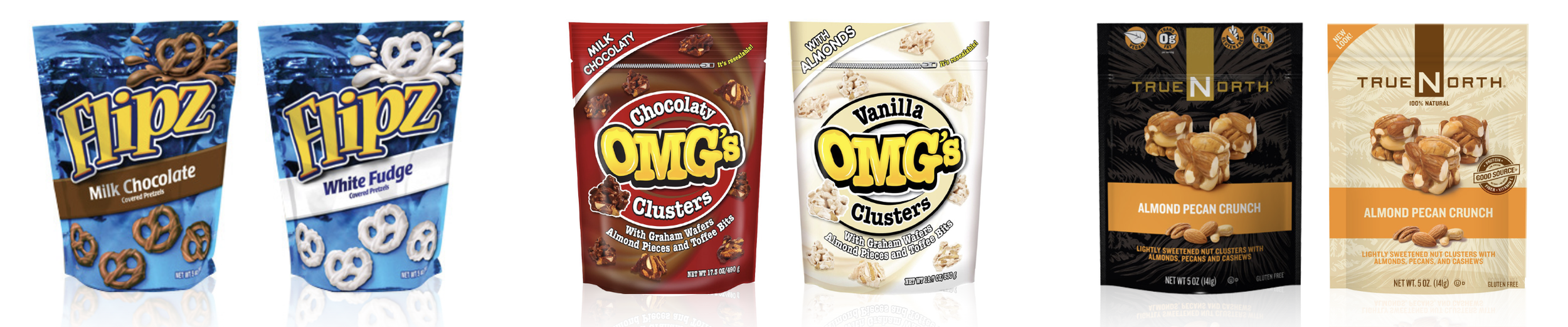
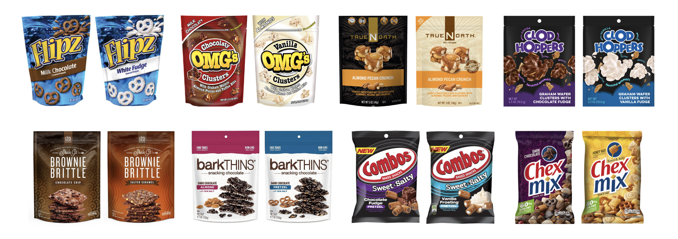
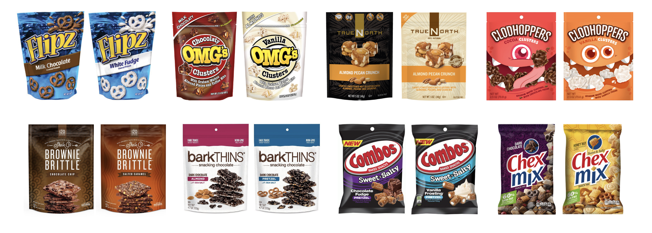
COMPETITIVE SET
Clear flavor benefits via product imagery
Repeated product imagery cues a continuous snacking eating experience
Color versioning is driven by product flavor
“Contained” product forms that aren’t messy or leave crumbs
DIRECTION 1: PRODUCT/FLAVOR LEAD
OBJECTIVES
• Hero the product & flavor
• Build from sweet-snack category cues.
VISUAL STRATEGY
Explore an ownable, intuitive product story that heros the deliciously poppable, delightfully clumsy shape of the Clodhopper.
STRATEGIC DIRECTIONS

DIRECTION 2: STORY LEAD
OBJECTIVES
• Disrupt at shelf with an engaging brand story
• Build on “for me” millennial insights.
VISUAL STRATEGY:
Personify the Clodhopper name and product story into a lovably awkward, munching character.
PRODUCT HERO | VISUAL SPACES
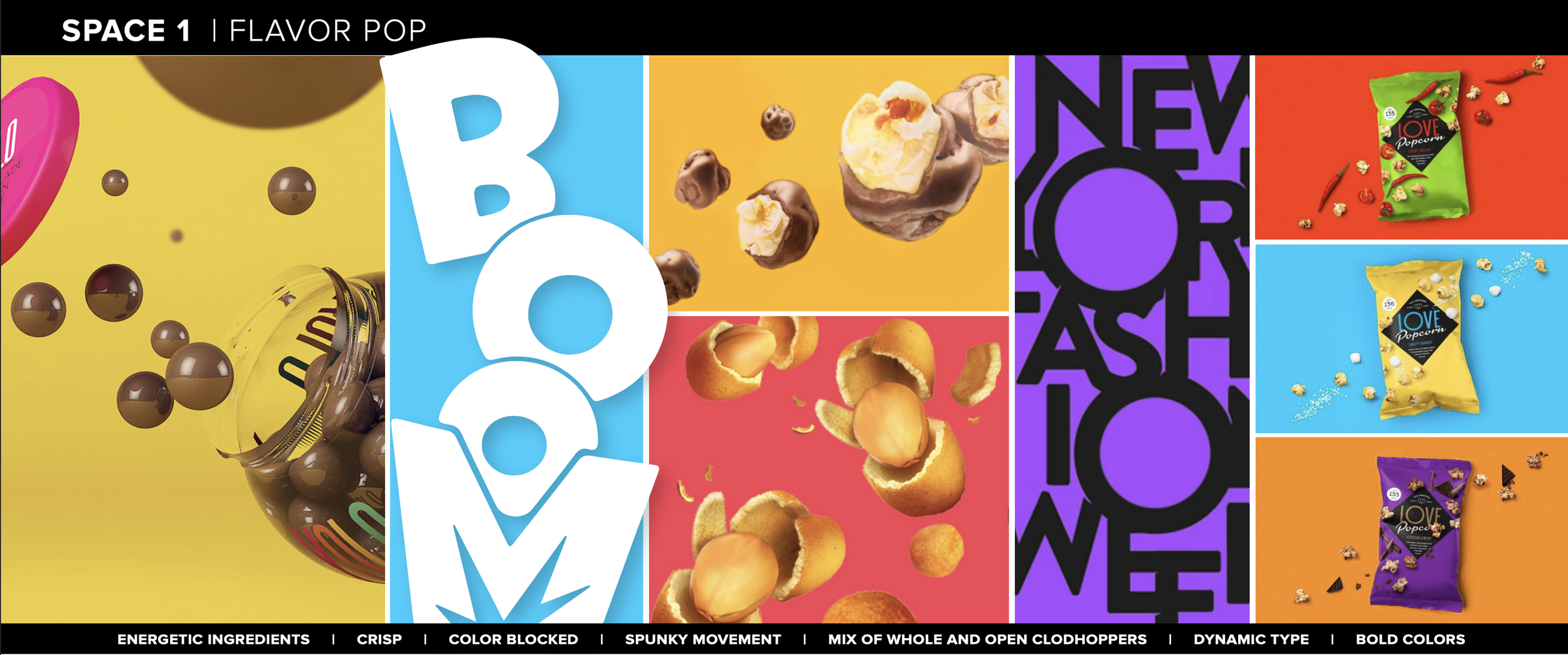
SPACE ONE | FLAVOR POP
Approach to Product Benefit:
Fun and energetic ingredients and logo cue an easy, on the go snacking experience
Brand Personality: Bold, active and playful
SPACE TWO | FOLLOW THE FLAVOR
Approach to Product Benefit:
Logo and ingredient personify the delightfully clumsy shape of a Clodhopper
Brand Personality:
A true original that’s daring and a bit offbeat

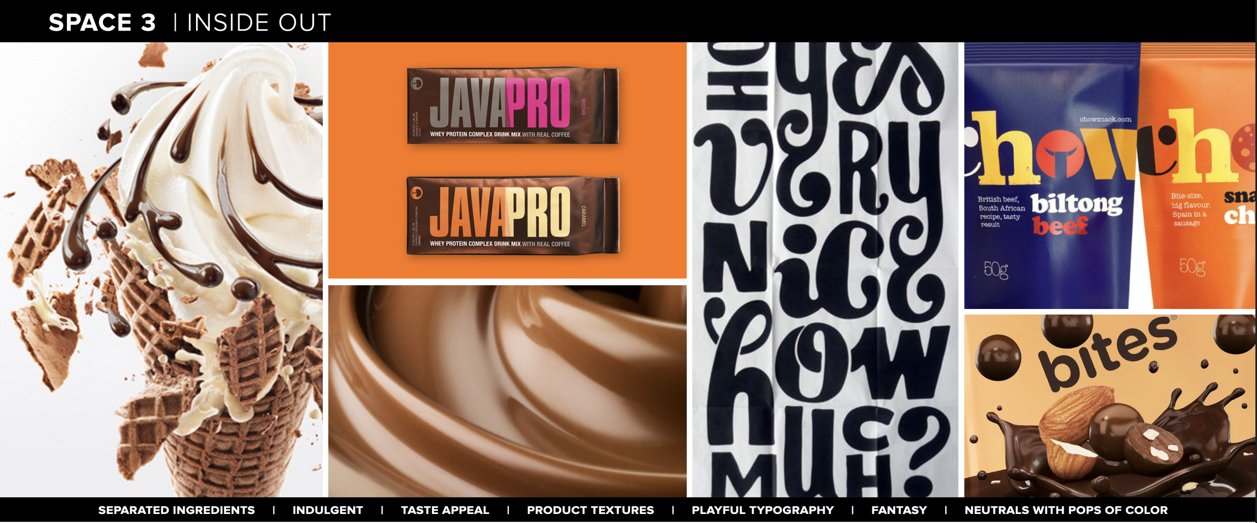
SPACE THREE | INSIDE OUT
Approach to Product Benefit:
Using each individual ingredient to romance delicious flavor combinations
Brand Personality:
Delectably irresistible with a hint of fun
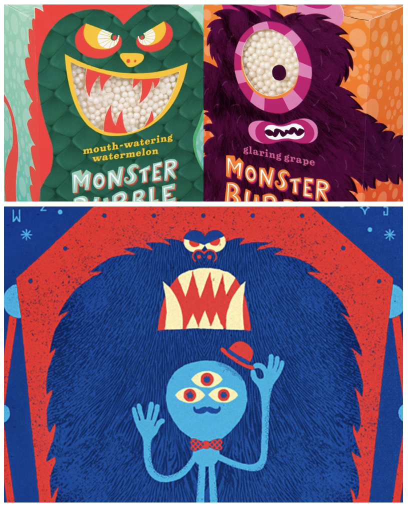
SPACE FOUR | MONSTER CRAVE
Approach to Product Benefit:
Hero the clodhopper taste experience by interacting with a munchie-obsessed character
Brand Personality:
Outrageous, fun-packed, playful

NOTE: Follow the Flavor, Inside Out and Monster Crave where the spaces selected to explore.
CLODHOPPER | HIERARCHY & COLOR STRATEGY
HIERARCHY
OPTION 1
FIRST PRIORITY: BRAND
OPTION 2
FIRST PRIORITY: VARIANT FLAVOR

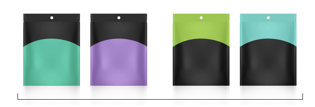
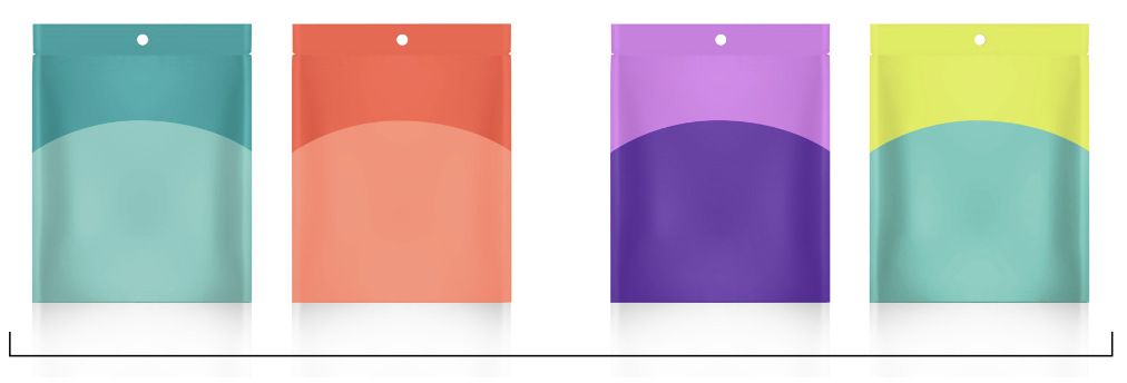
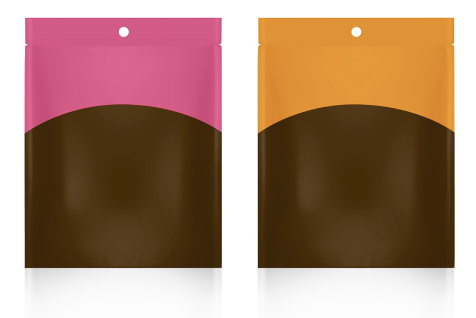
COLOR STRATEGY
BLACK + VARIANT COLORS
TONE-ON-TONE COLORS
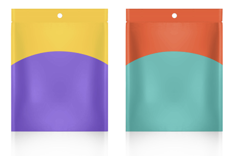
UNIFYING NEUTRAL + VARIANT COLORS
TWO BRIGHT COLORS

UNIFYING COLOR + VARIANT NEUTRALS
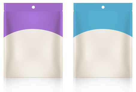
UNIFYING CREAM COLOR + VARIANT COLORS
FOLLOW THE FLAVOR

INSIDE OUT
MONSTER CRAVE | CHARACTER DEVELOPMENT
ILLUSTRATION STYLES

Flat colors and graphic shapes create depth in a modern style.
Tone on tone details create dimension and a tactile texture.

Defined outline of character shape and features with a flat color background.
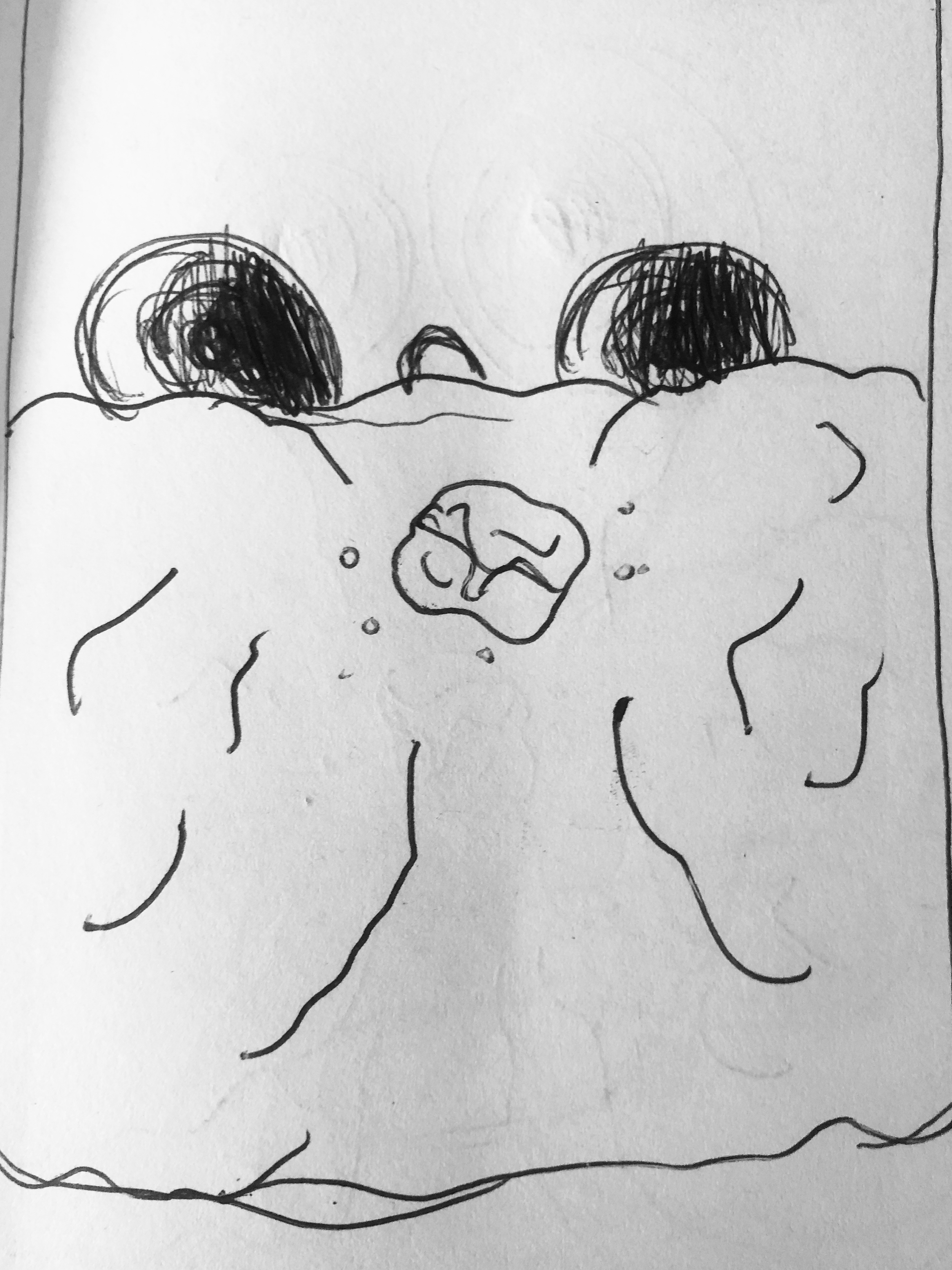
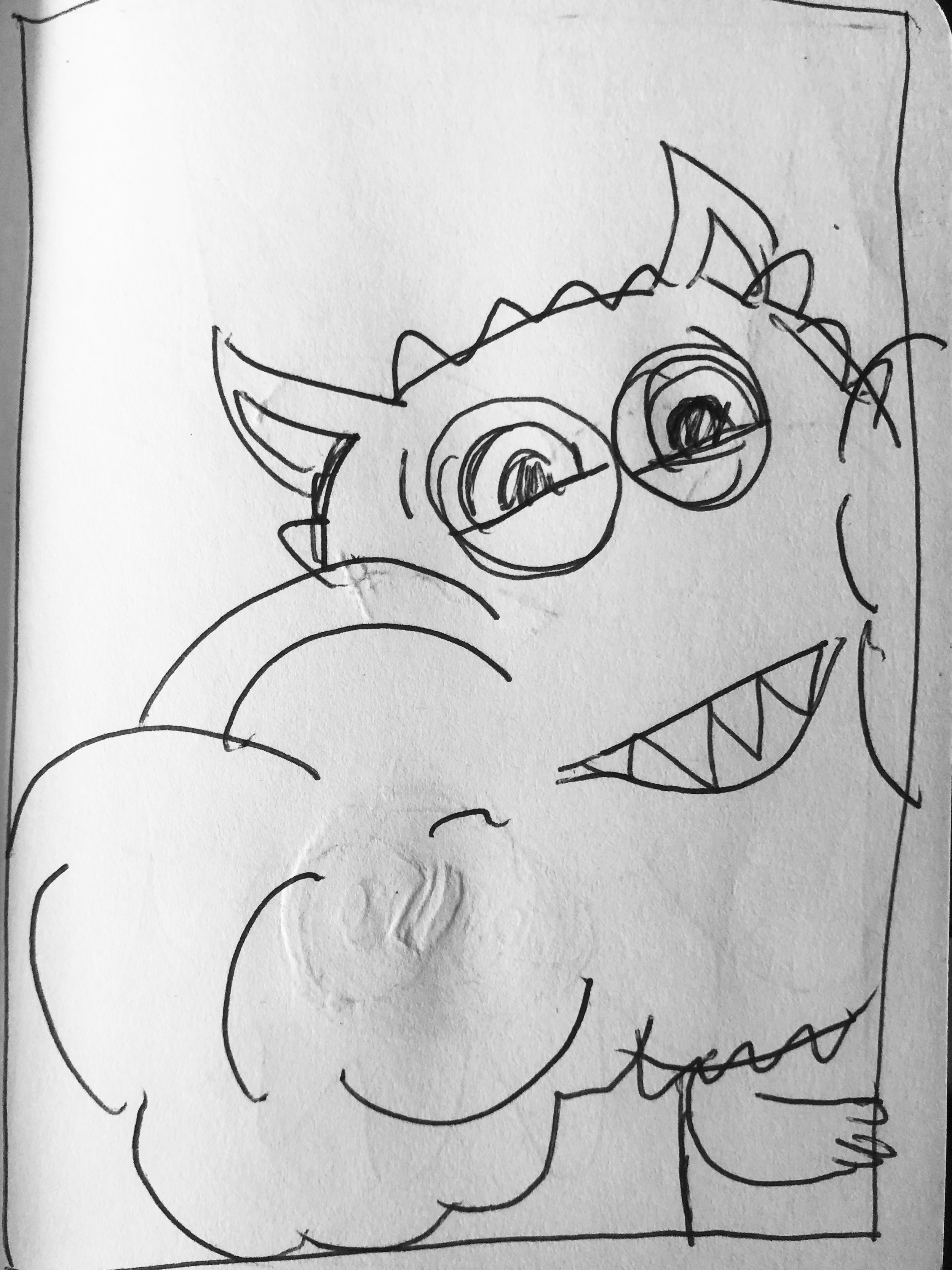
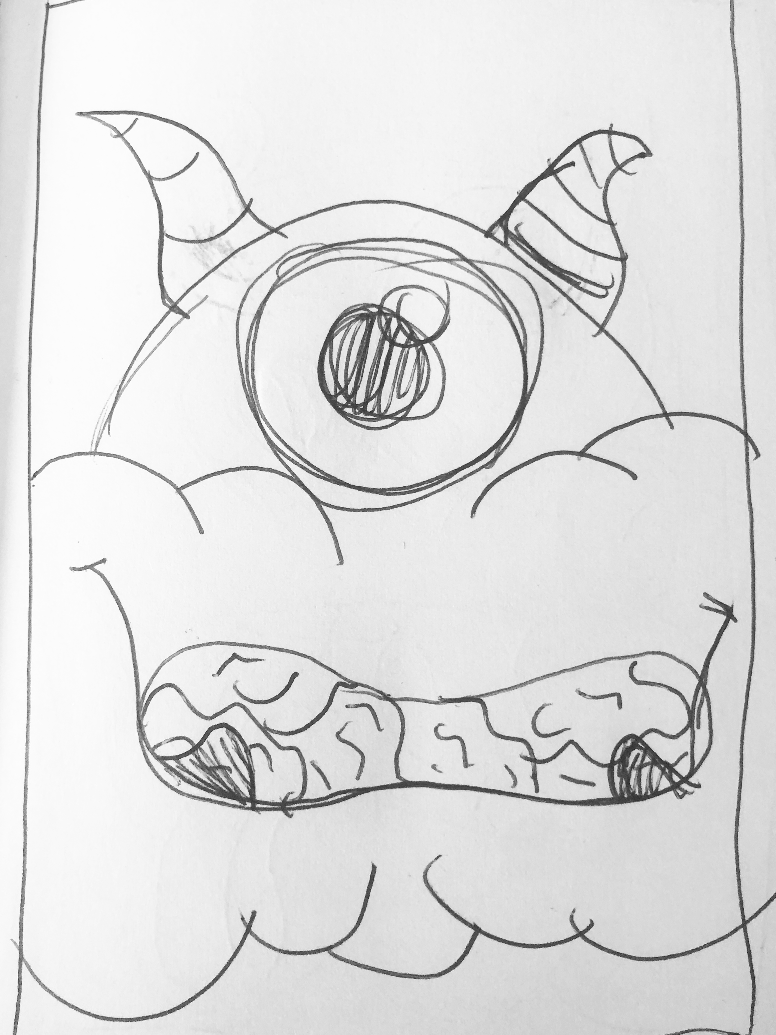
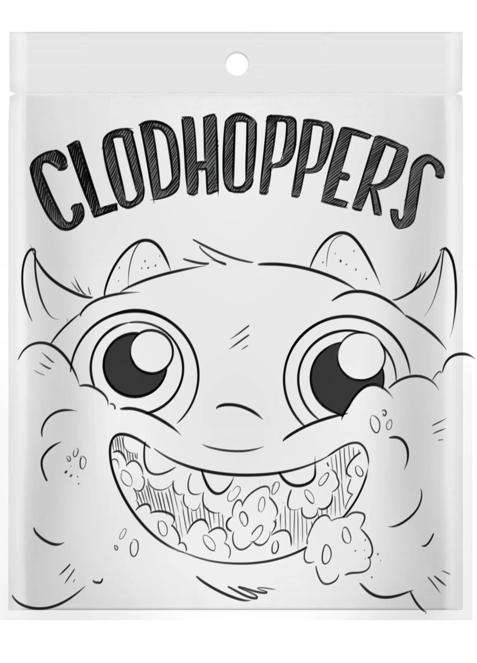
INITIAL SKETCHES


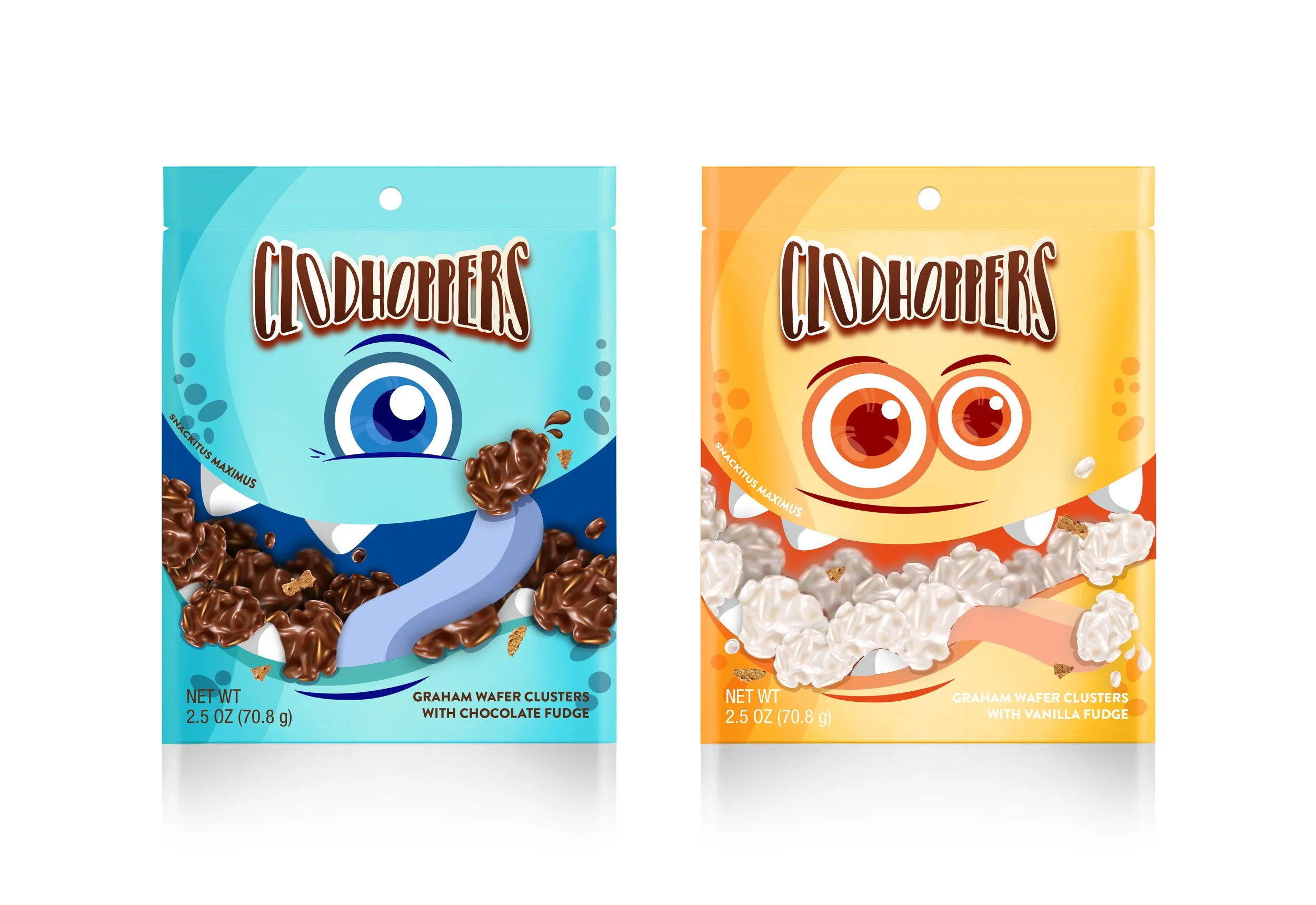
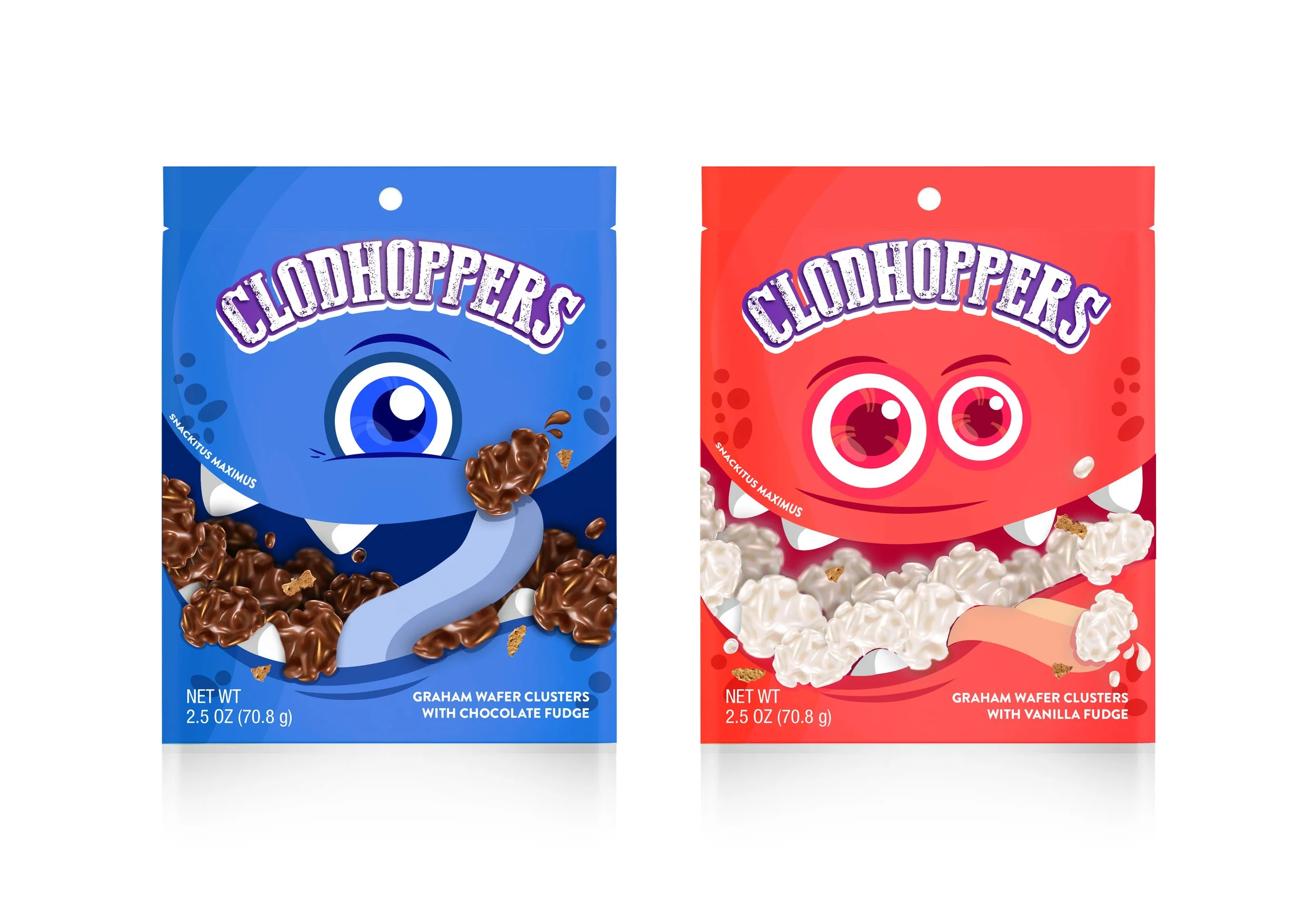
MONSTER CRAVE | DIRECTION 1
MONSTER CRAVE | DIRECTION 2

MONSTER CRAVE | DIRECTION 3
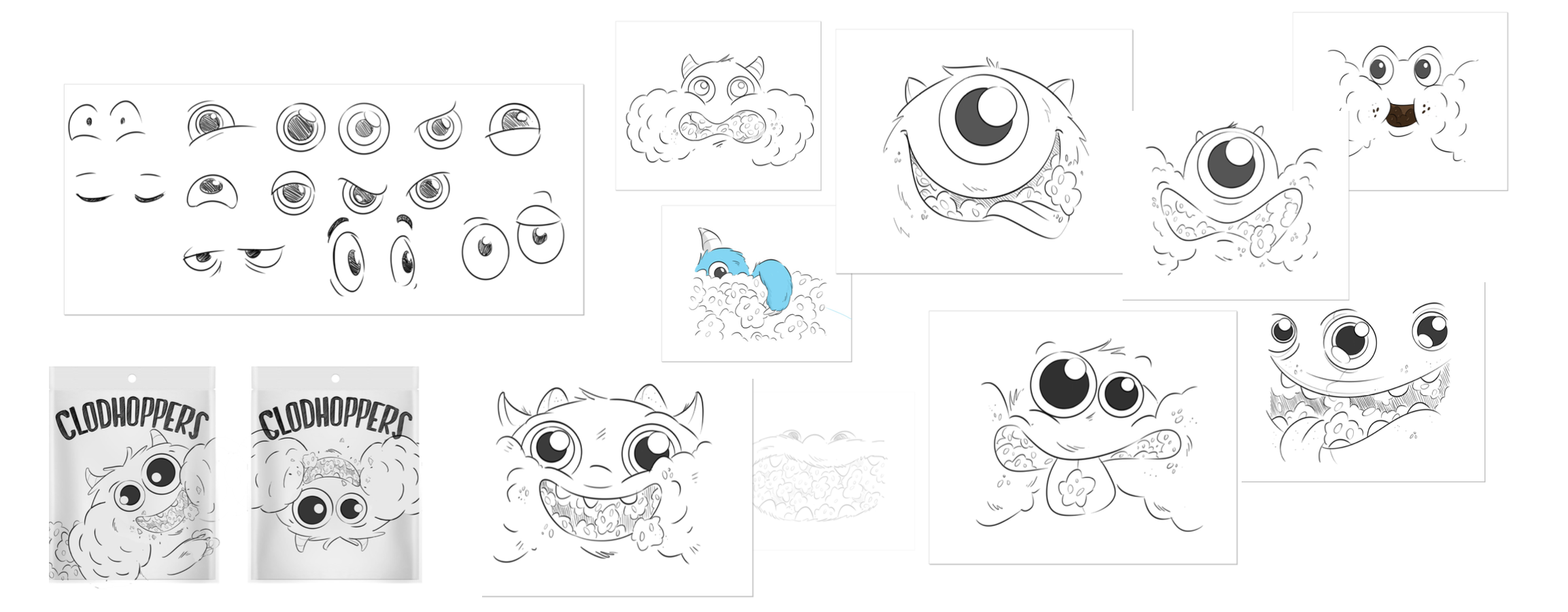
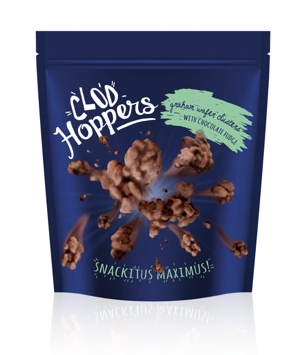
ADDITIONAL EXPLORATIONS


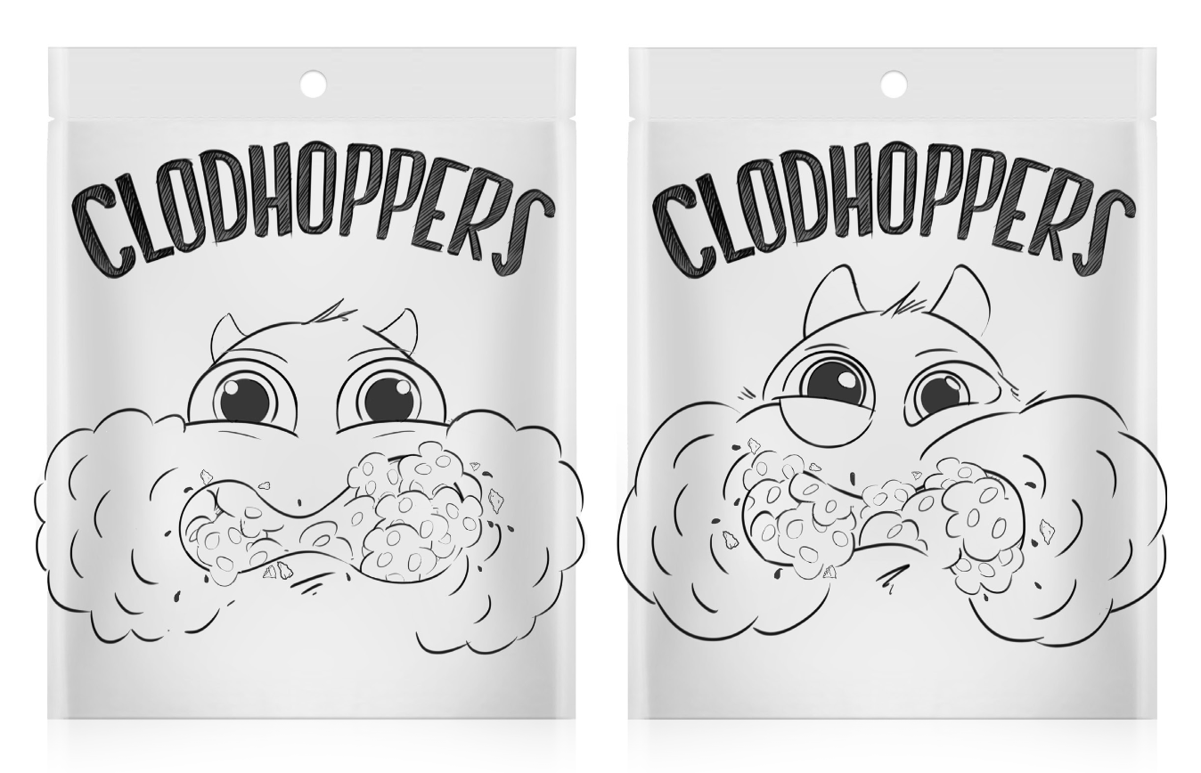
MONSTER CRAVE DESIGN OPTIONS | ROUND 1

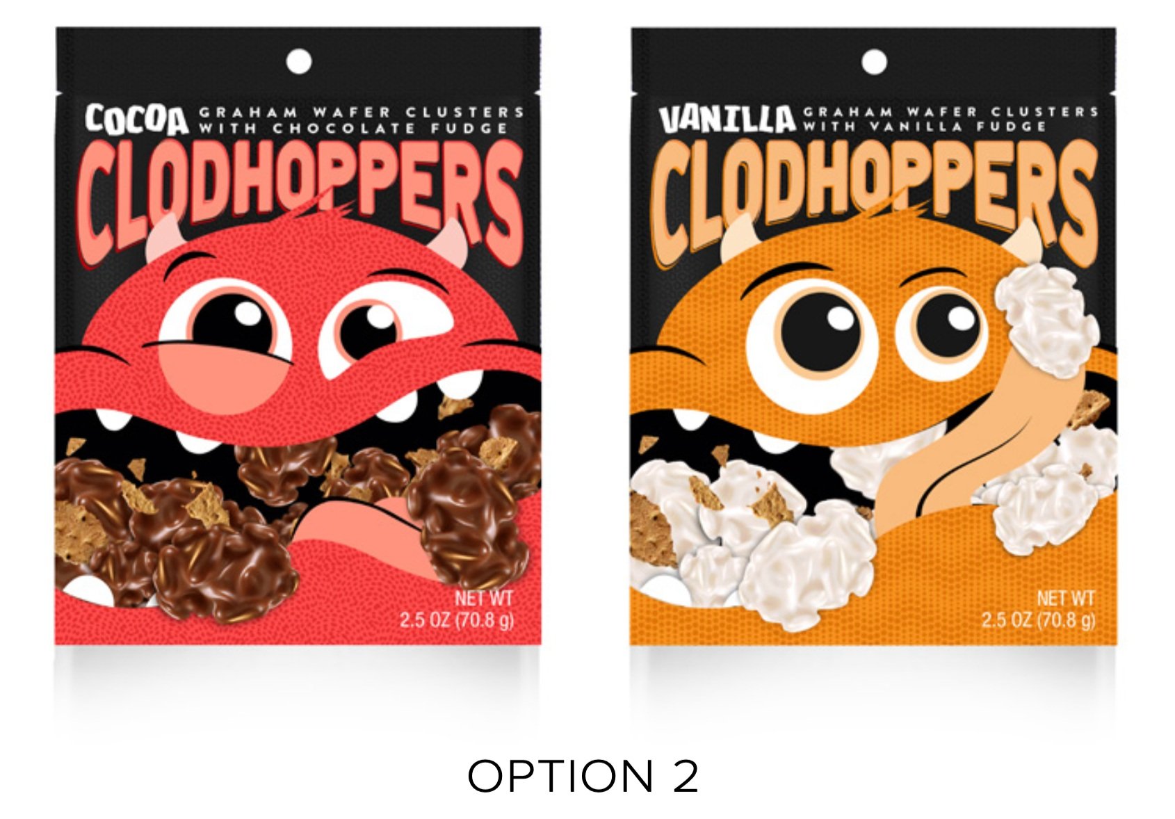
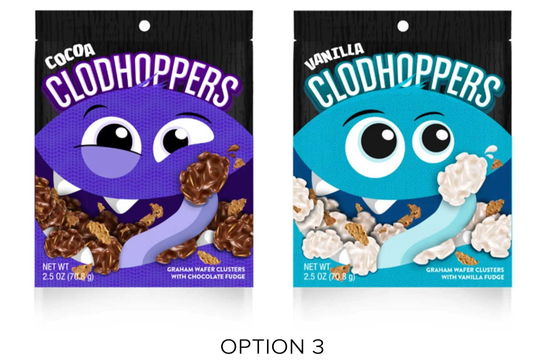
Moving forward with Option 1
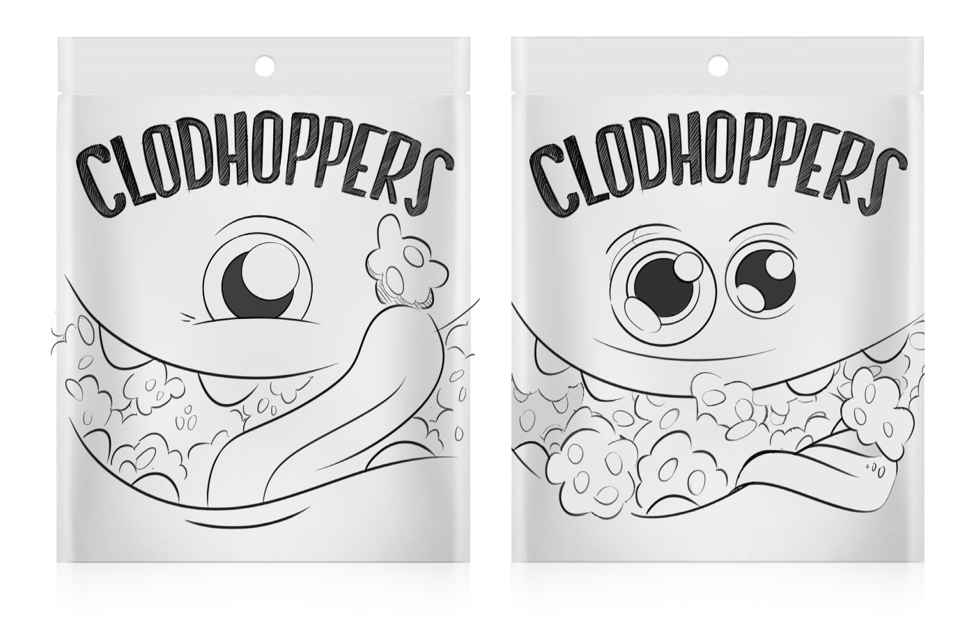
MONSTER CRAVE DESIGN OPTIONS | ROUND 2

OPTION 1: Flavor and Description Typography

IN COMPETITIVE SET

OPTION 2: Flavor and Description Typography
IN COMPETITIVE SET

FUTURE COLOR VARIATIONS

TYPOGRAPHY + LAYOUT
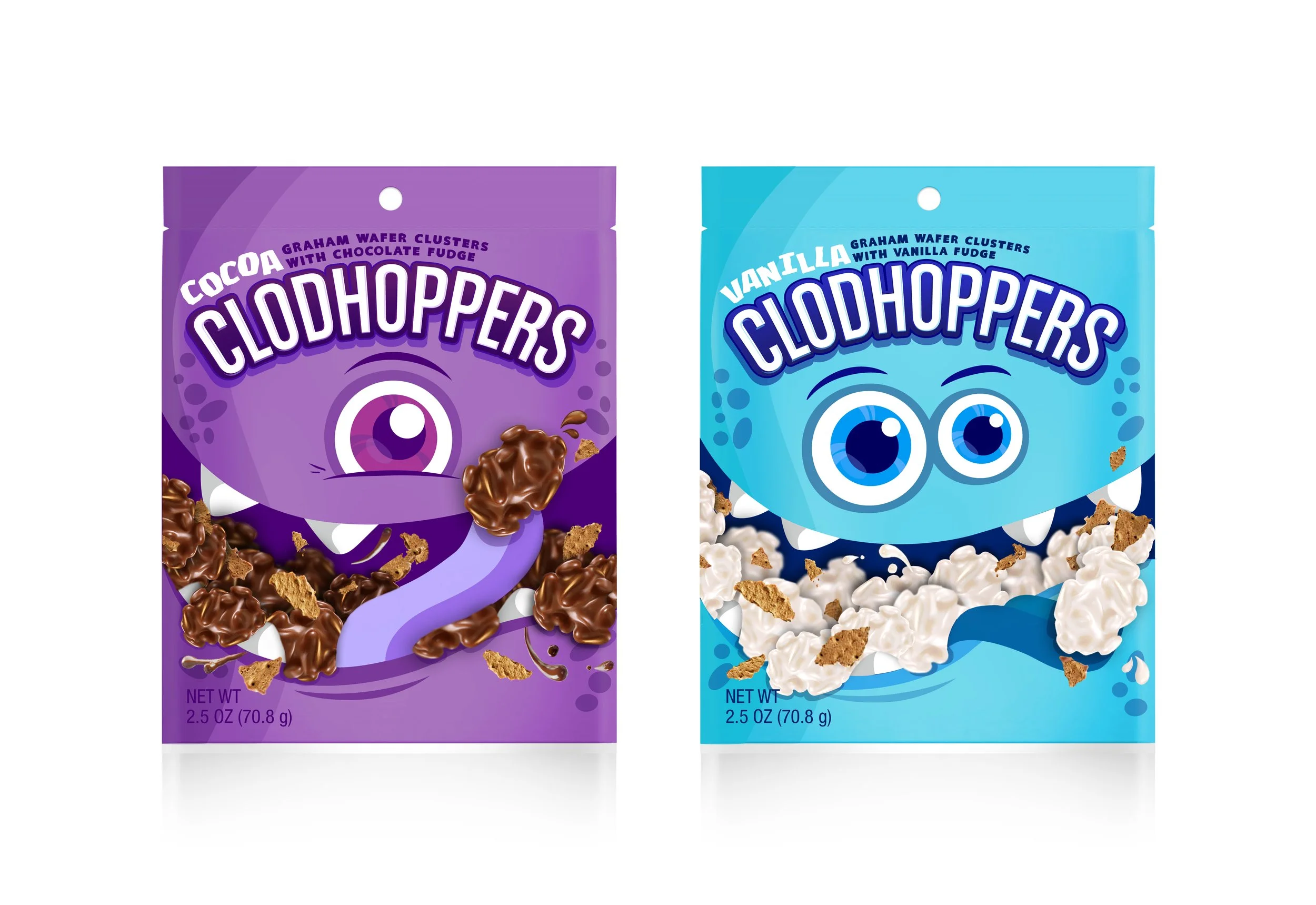
SELECTED
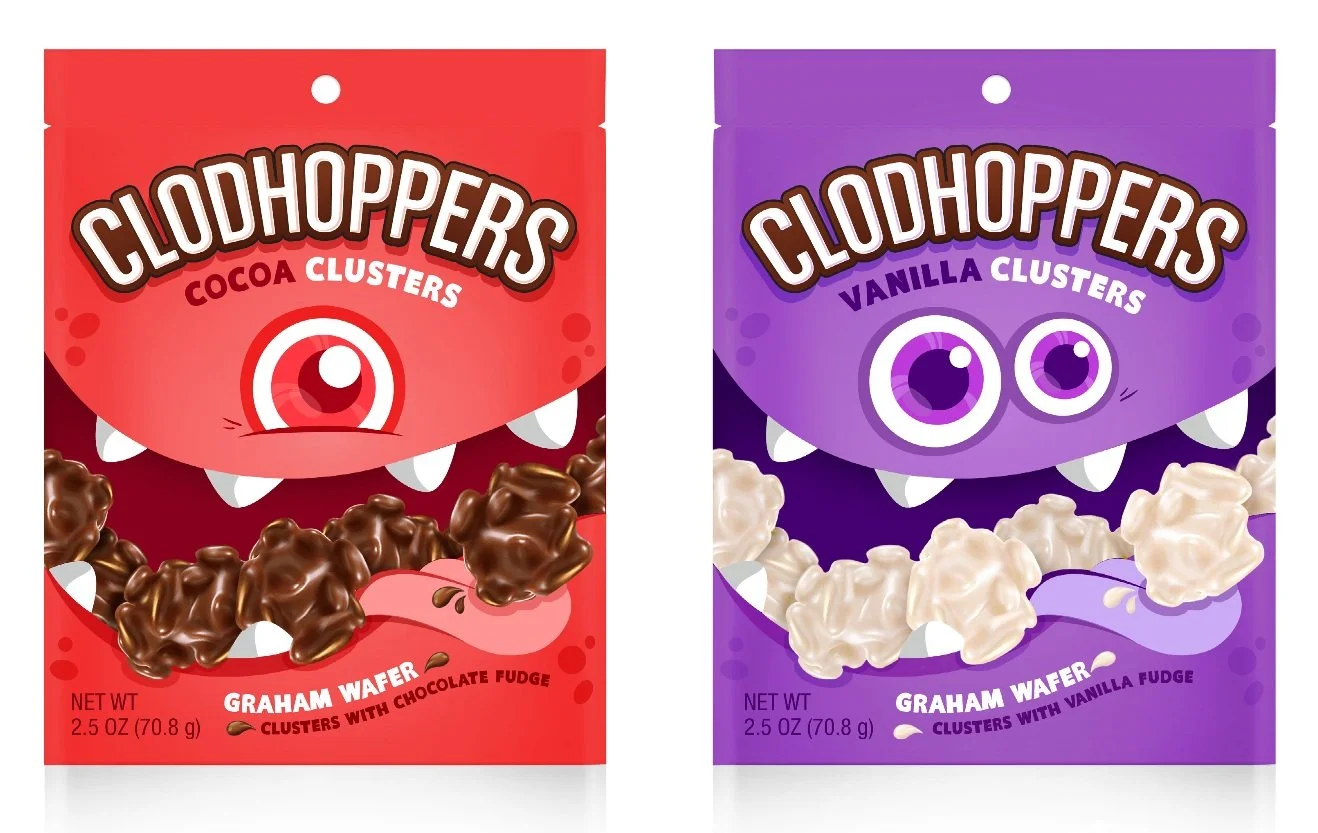
OPTION 1
Curved typography for description echoes the curve of the character’s mouth.
OPTION 2
Regular straight lines are more familiar.

OPTION 3
The up-and-down alignment echoes the arrangement of the clodhoppers in the mouth.
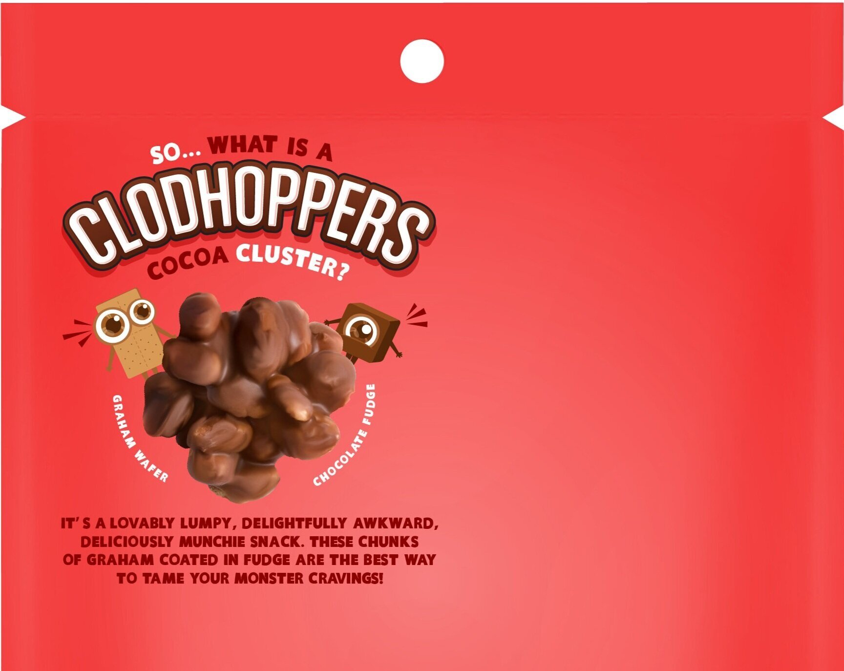
BACK OF PACK


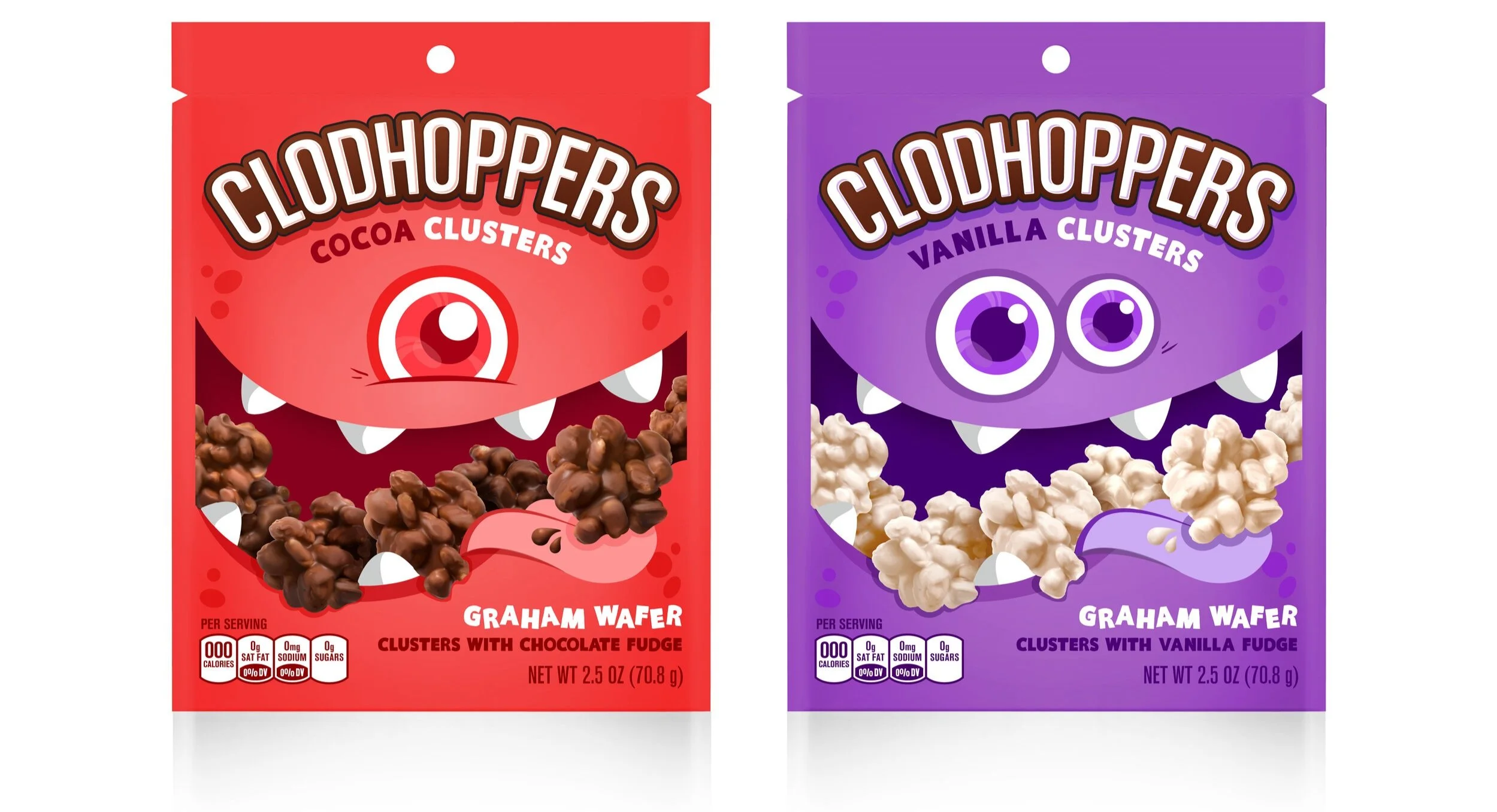
FINAL DESIGNS
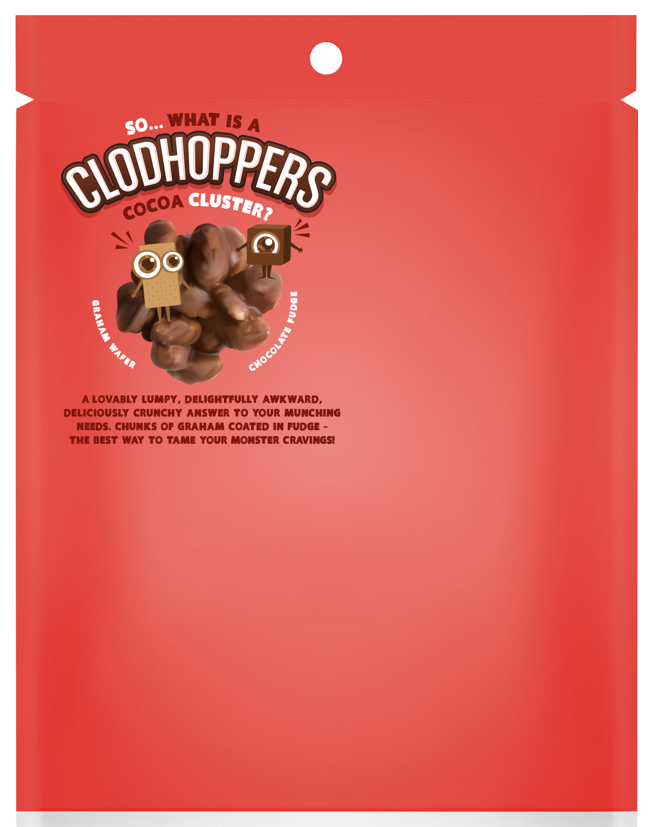
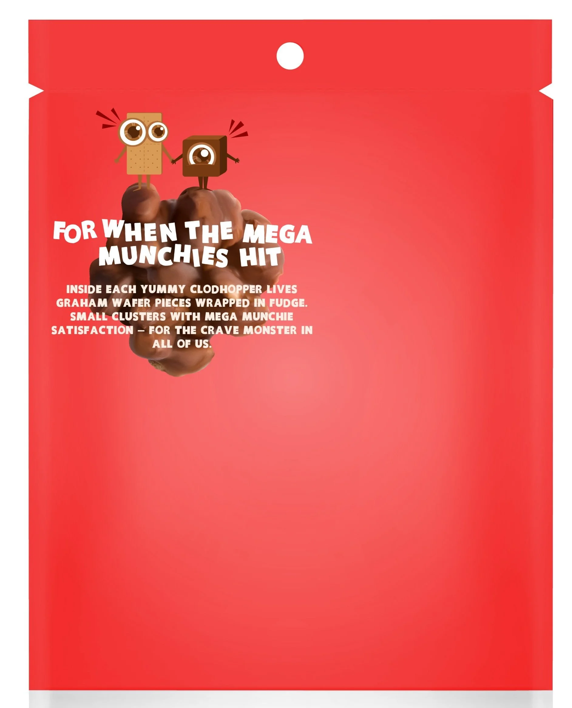
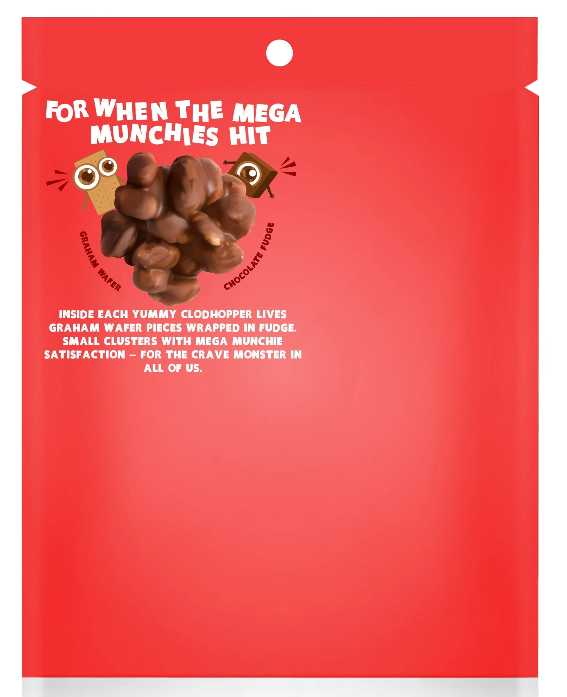
The back of the pack continues our concept by personifying the ingredients into their own little characters. Several options were considered before selecting the one below.