Maeno & Co. Re-Branding
Client: Maeno & Co.
ROLE
Brand Designer, Website Designer
TOOLS
Adobe Photoshop, Illustrator, After Effects
LENGTH
1 Month
PROJECT
Client is a Public Relations and Event Production company in Santo Domingo, Dominican Republic.
As one of the most prestigious PR and event companies in the city it has as clients some of the biggest and well-known brands within the country.
The goal was to make the brand express the more premium solutions they offer as well as a less childish air, without losing all of the character that the company brings to every project.
At the start of the project the logo looked like this one. They also had an all-white version. Below are the few things I identified that needed to improve:
The full logo uses three different typographies the boxy main one, the one for the ampersand and the sans serif one for the services.
The boxy main typography’s eyes, and apertures are incredibly thin, so when the logo is scaled down it becomes illegible.
Turned into a one-color option, the ampersand is hard to tell apart from the main typography at a distance.
Overall the logo gives the feeling of young inexperience and exuberance and not of an established knowledgeable firm.

ASK
Create a new logo that evoques luxury and a premium quality feel.
Create a logo that can compete with other logos in the same industry.
Keep the name “Maeno” in some way since the brand relies on that name recognition to be effective.
The client would prefer to keep a wordmark for the previous reason but also to build upon their first logo which had already garnered some respect.
The new logo should borrow from prominent newspaper typography because the agency relies heavily in printed and digital news media.
Explore logos that resembled the CEOs personal logo / brand.
COMPETITIVE SET


REFERENCES
The competitive set that was gathered lacked the style the client was looking for in their new logo so they felt safe in going forward inspired by the references I gathered here.
The common threads were:
Serifs
Dramatic thicks and thins with elegant curves.
Letters that merged or were completed by negative space
The CEOs personal logo / brand is “Maeno Sin el Co.” which translates to Maeno without the Co. This logo is formed by very thin homogenous lines and an icon of a collared shirt.


DESIGN ROUND 1
6 options were chosen to work out the details. The options employed different combinations of isotypes, wordmarks, and square shapes that echoed the initial logo.

Option 1

Option 4
Option 4 was eliminated because it had similar issues as the initial logo in the eyes and apertures of the letters being too thin.

Option 2

Option 5
Option 5 lacked elegance and was too similar to the old logo.

Option 3

Option 6
Option 6 was eliminated because the client decided it was too similar to his personal brand and he wanted the company to stand apart from that.
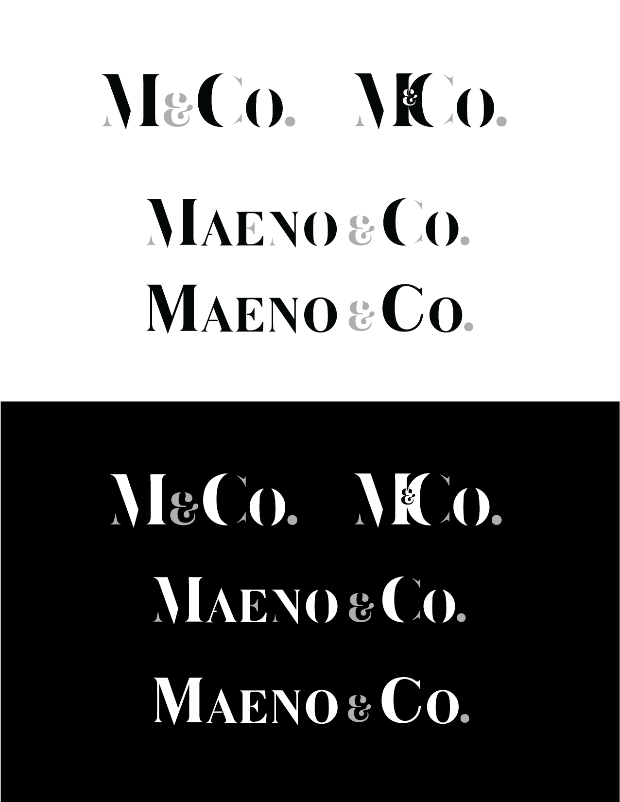
DESIGN ROUND 2
Elements from Options 1- 3 in the first round were selected to proceed to the next round of designs.
Different kinds of serifs were considered including slab.
From this round I kept the typography in Option 2 and the square / rectangle + layout in Option 5.
The thin parts in Option 1 disappeared when tested at small scale.
Option 3 lacked the character of the initial logo.
Option 4 looked too utilitarian.

Option 3

Option 4
Option 1
Option 5

Option 2
FINAL DESIGNS
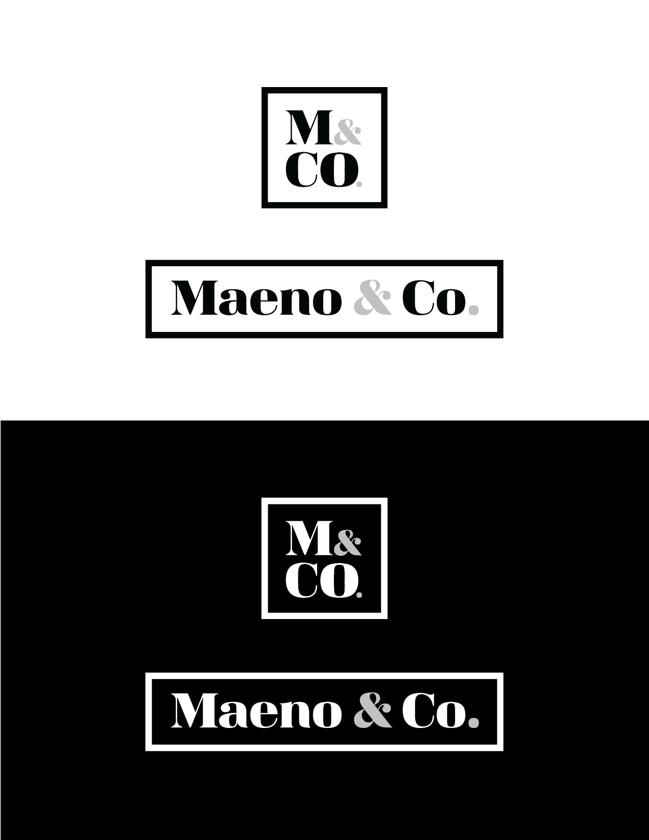
The final designs incorporated the parts of the previous iterations that best met the brand’s new message while keeping the parts of the old brand that were continuing as a foundation.
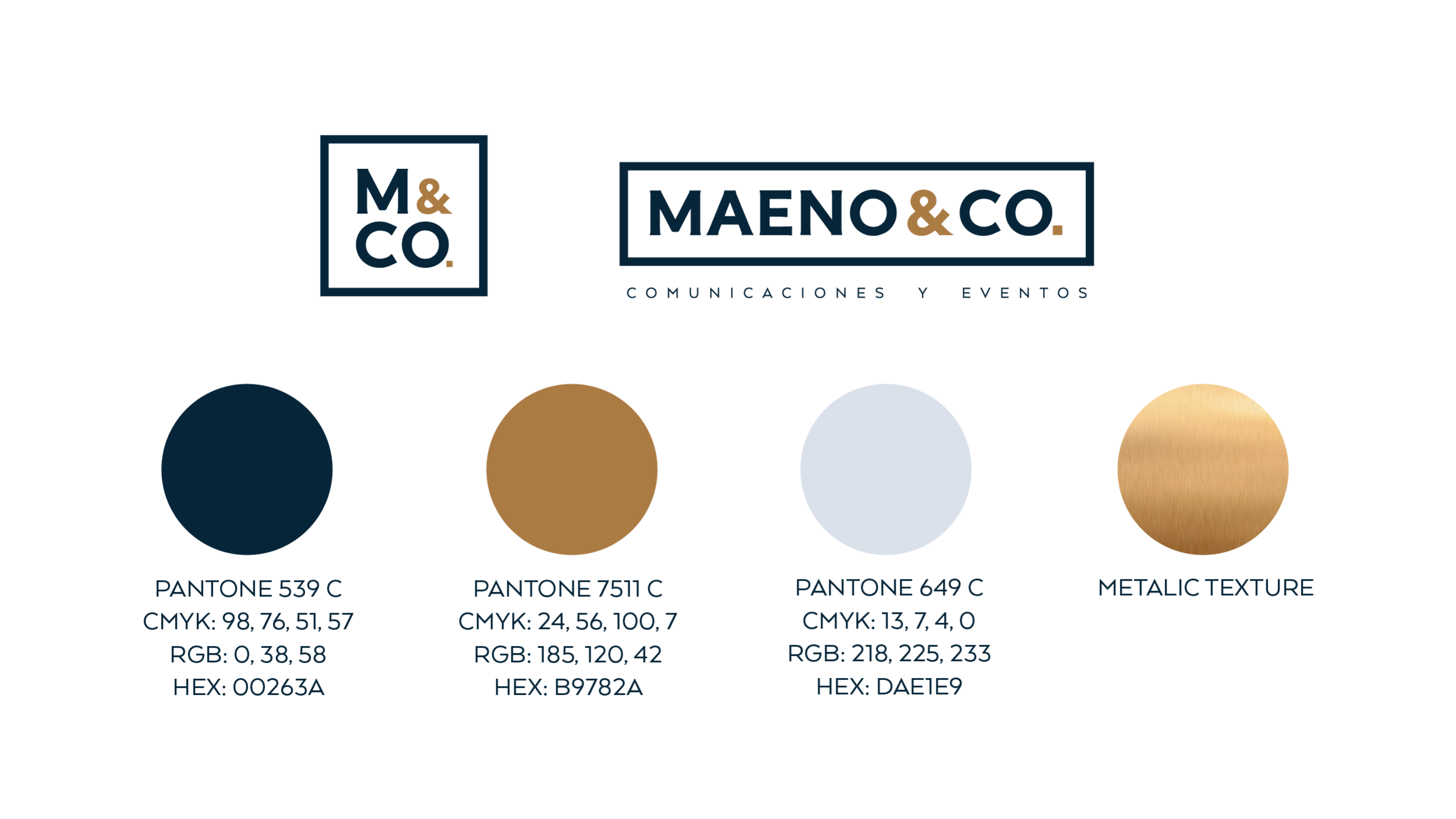
The square / rectangle enclosure echoed the structure and boldness of the initial logo.
It also lent the new brand the feel of a stamp which was one of the qualities the client enjoyed from the previous logo.
The typography chosen was an in-between of the utilitarian boxy-ness of the initial logo and the formality of a serif font.
It doesn’t have the contrast in thick and thins to create a strong mark where no parts would get lost at a small scale.
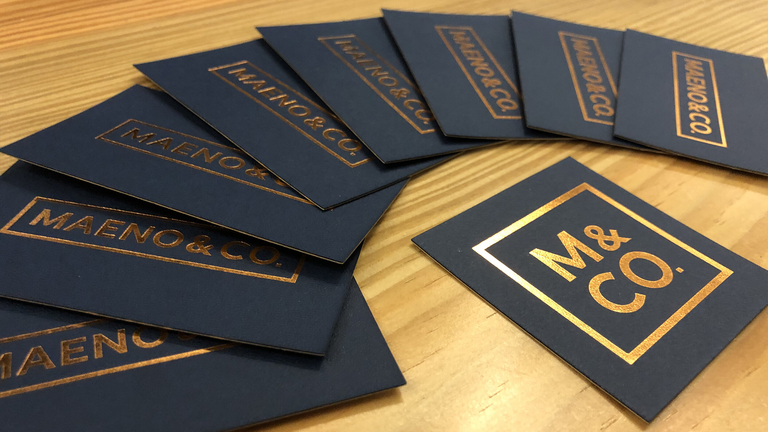
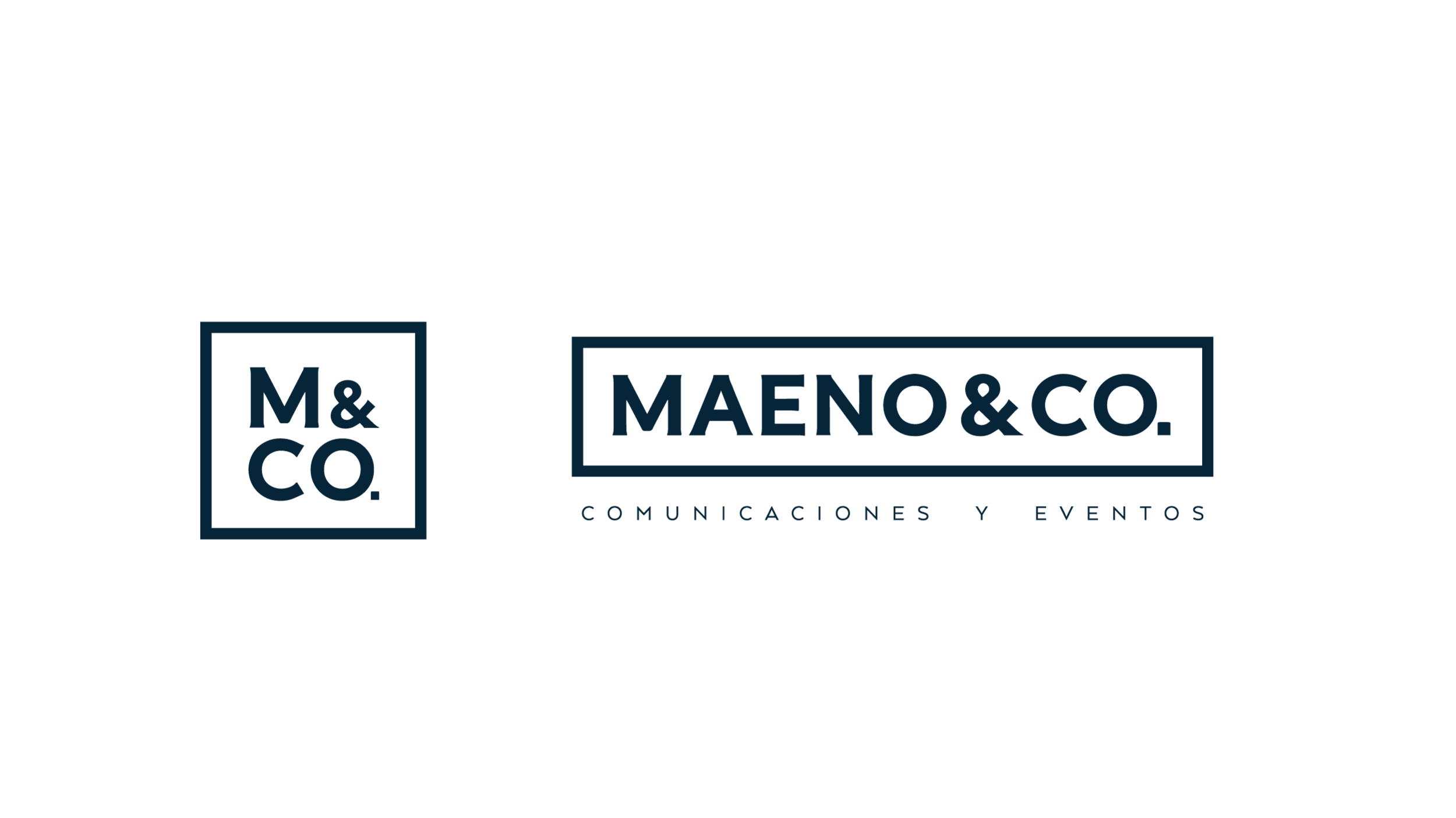
The final color palette is a grown-up version of the original. With a deeper, richer blue and a much lighter gray for more contrast.
A third color was added in the form of a coppery tan for warmth and to add finesse in the form of foil for printed materials.

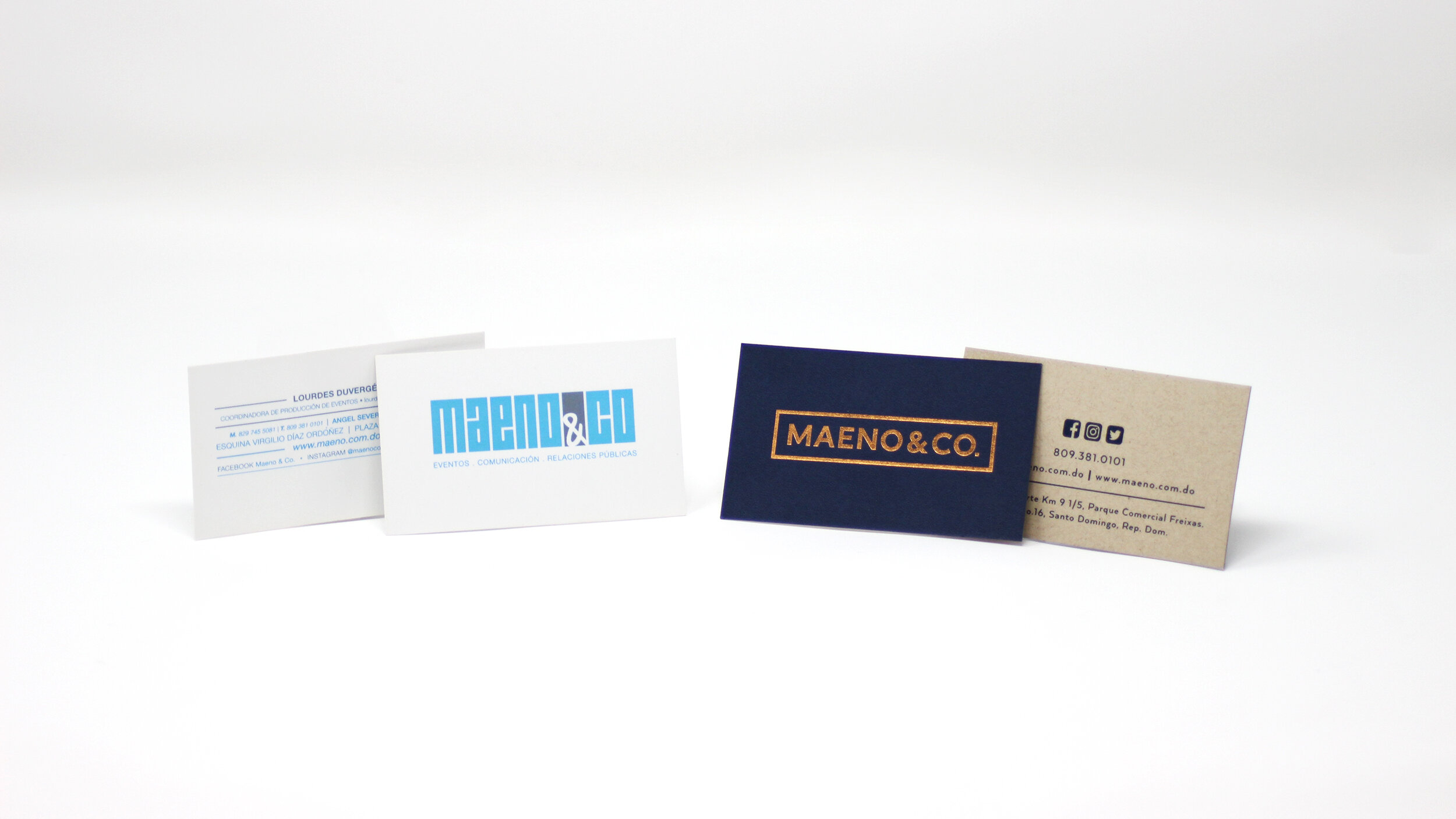
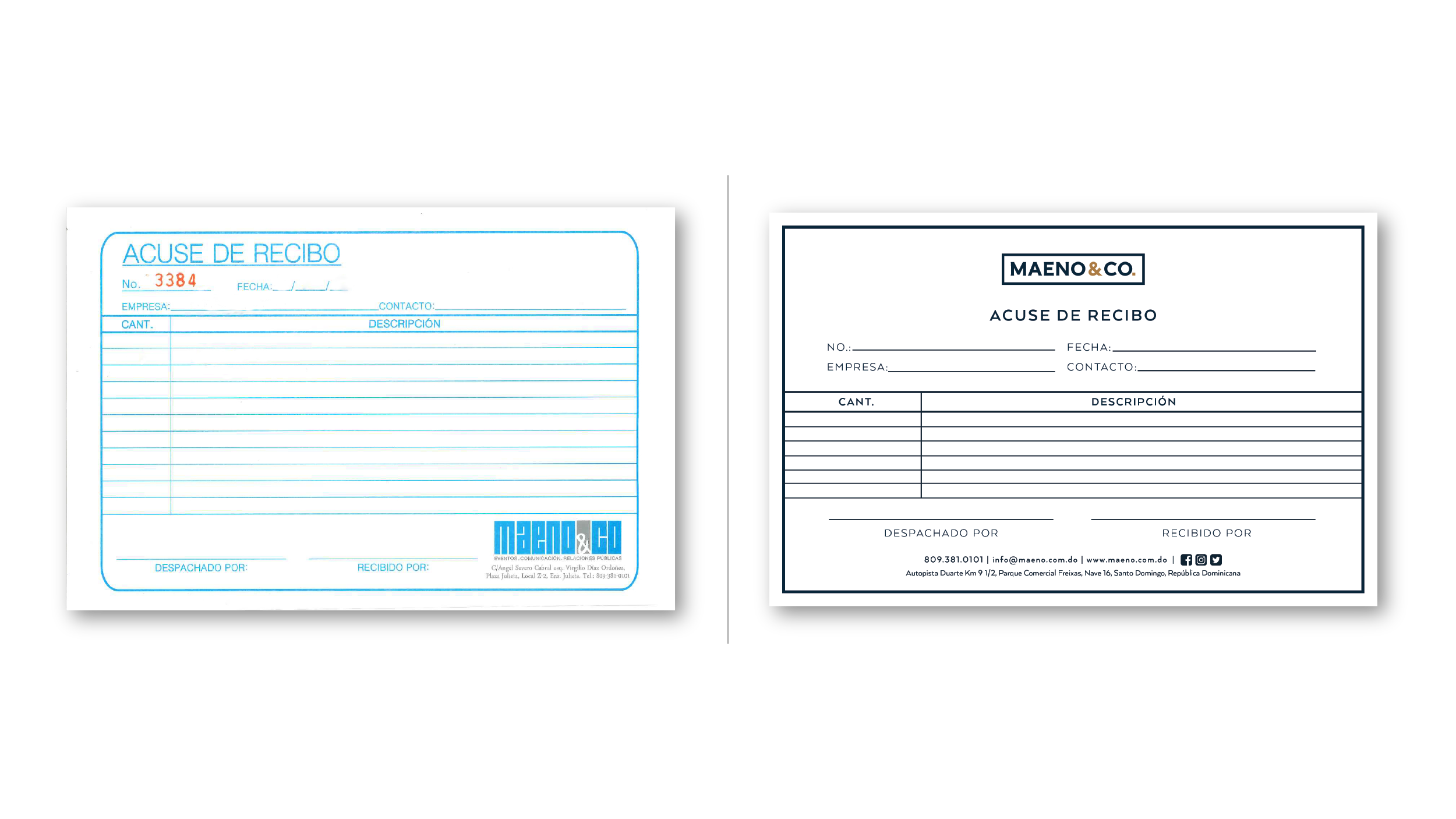
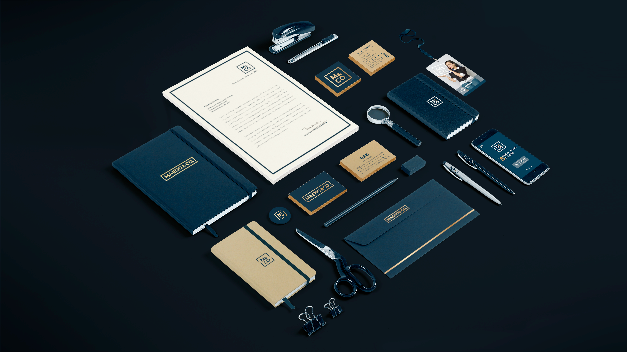
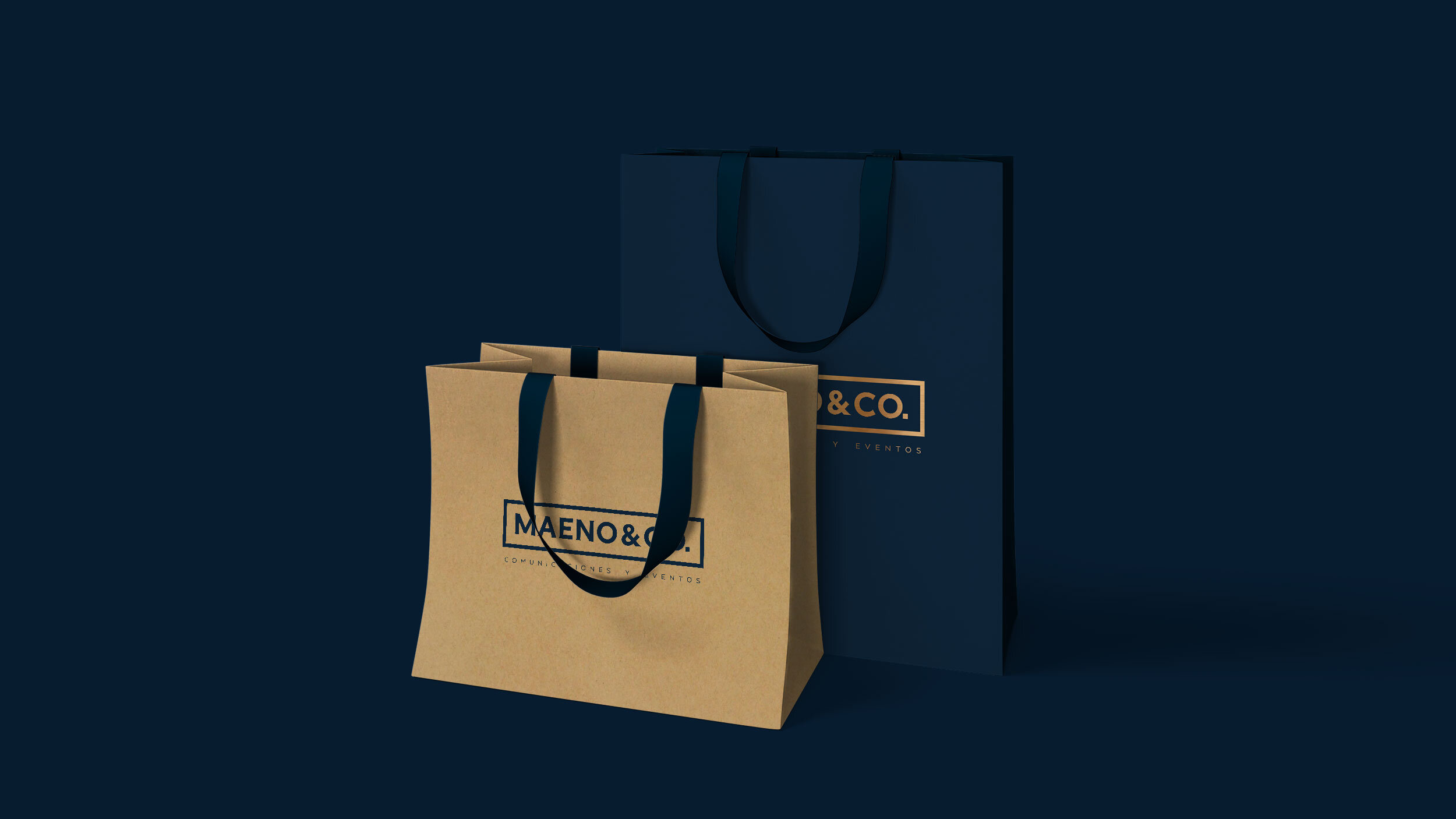
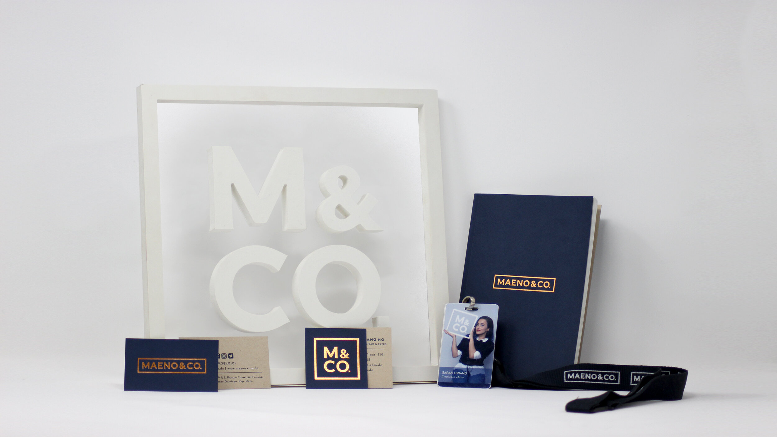
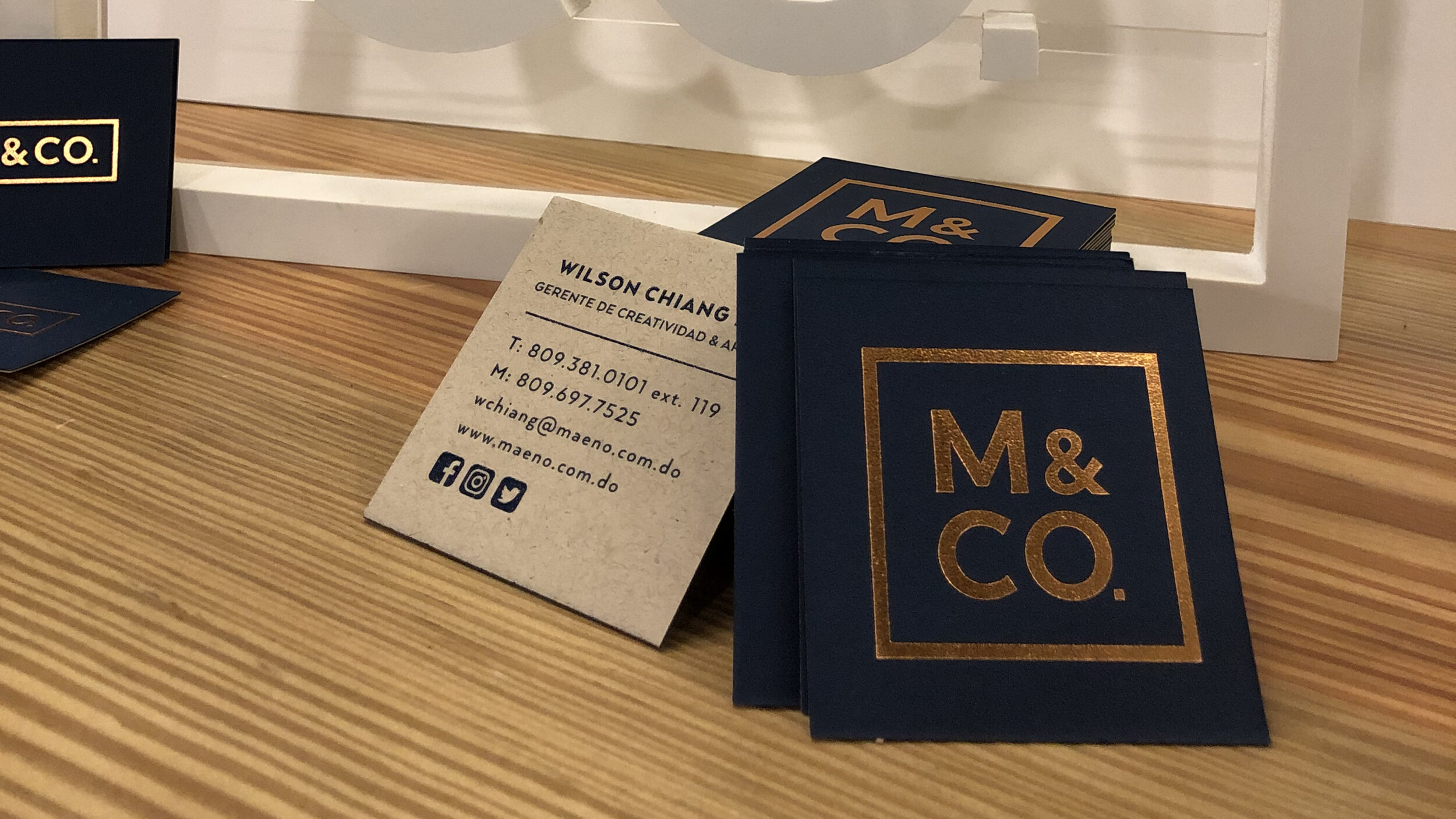
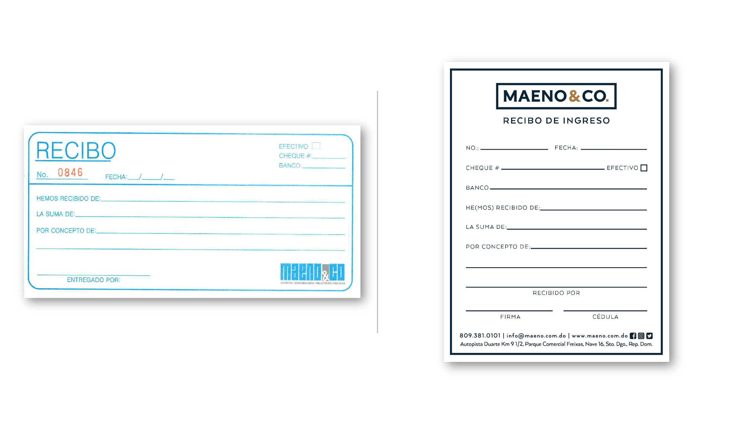
PRINTED MATERIALS
The printed materials echoed the new message by employing elongated vertical lines, premium textures in materials and sharper angles as well as cleaner layouts and typography use.
The elements follow the modularity and flexibility of the logo by having a variety of rectangular and square shapes.