Taxpoint Re-branding
Client: Taxpoint | Accountants and Fiscal Advisers
ROLE
Brand Designer, Website Designer
TOOLS
Adobe Photoshop, Illustrator, After Effects
LENGTH
3 weeks
PROJECT
Taxpoint was an emerging small company dedicated to providing in-person and virtual accounting services and fiscal advice to their clients. Their goal was to make the experience of filing taxes as easy and friendly as possible within the Dominican Republic.
The closest business equivalent in the US would be H&R Block at a much smaller scale.

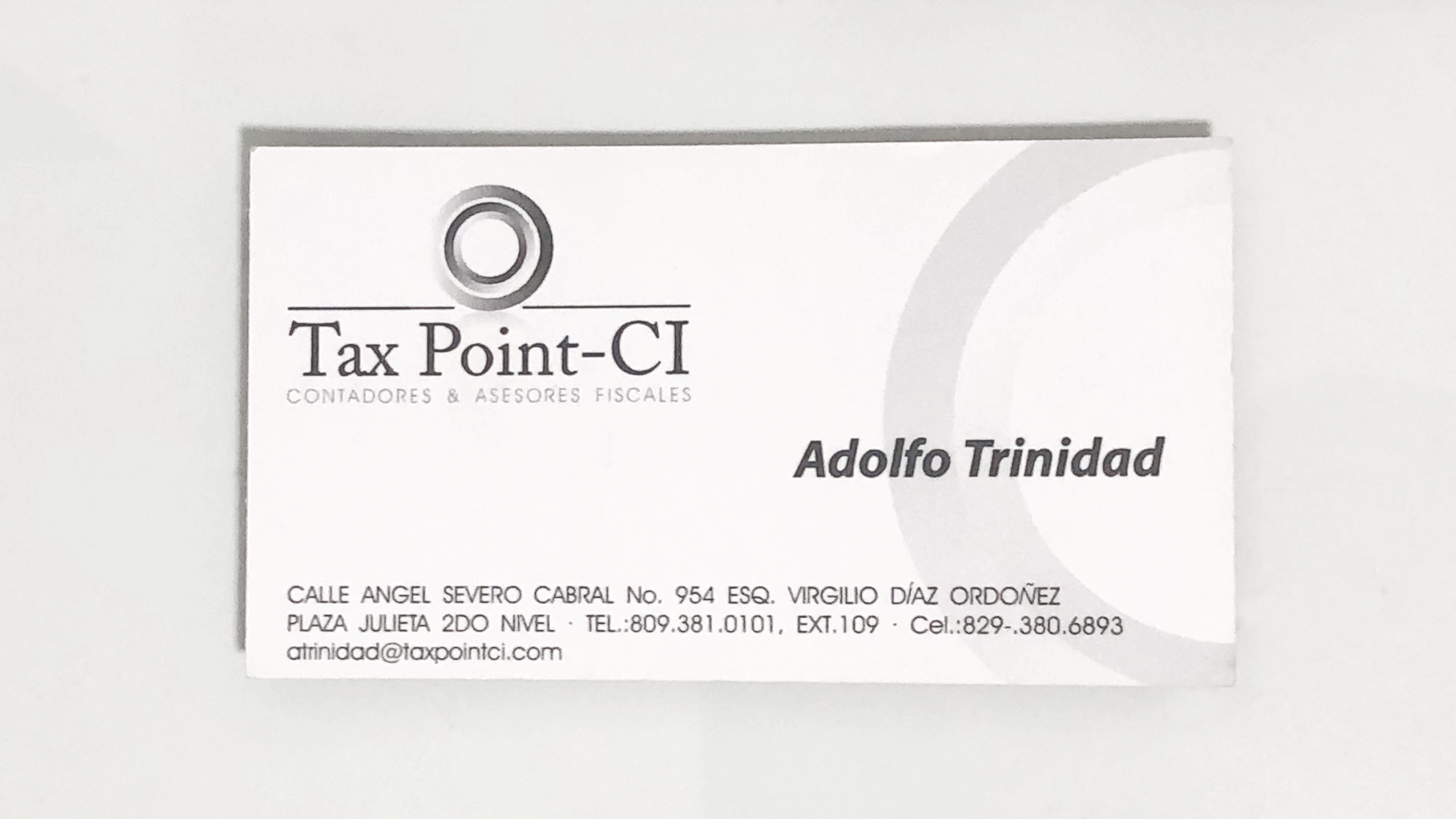
This was the logo the client had been using for a very long time. They had been financial advisers for nearly two decades and the logo hadn’t been changed since the beginning of the business.
They requested a corporate identity that “felt younger” while still communicating their experience and expertise. Their business was pivoting to a different format and growing at the same time.
FRAMEWORK
SUMMARY
At the time of this project there was competition in the market with very poor design standards.
Much of the research and references were selected from businesses outside of the country.
The style of the new identity needs to communicate efficiency, inspire confidence, and a feel of modernism for younger audiences.
The market analysis demonstrated that there were opportunities in two directions:
Typographic: including some play with icons replacing letters or words.
Iconographic: an icon that represents the business with the name as secondary in the hierarchy with a simple font.
DESIGN FOCUS
Intuitive, simple, and direct communication of the product benefit (efficiency, confidence, and user friendly) with a modern look.
Balance the communication of a reliable financial benefit while maintaining the brand accessible and friendly.
Explore design systems that allow for flexibility to communicate through different mediums.
OBJECTIVES
Position the business as the new, more modern (and better) option for financial assistance.
For the time being, use the corporate identity as the only vehicle of communication with the clients.
Consider a flexible design to adapt to different formats and brand expansion.
Client requested that I turn to references and research from foreign businesses with higher design standards so they could stand out in the local market.
COMPETITIVE SET
Focus on typographic logos.
Colors were very commonly green (money), blue (inspires confidence) and red (commonly associated with finances / math).
Typography was not very well considered in many cases which influences the older look to many of them.
Many of the examples didn’t have many ornamentation besides the typography.


VISUAL SPACES
SPACE 1: FRIENDLY TYPOGRAPHY
Approach to Product Benefit: High quality financial assistance with a friendly and kind service.
Brand Personality: Modern & Friendly
Lowercase typography, greens and blues, simple, rounded typography.
[SELECTED]


SPACE 2: REPRESENTATIVE ICON
Approach to Product Benefit: The icon and patterns derived from it reflect the business objective of giving the best financial service.
Brand Personality: Modern, Efficient, Bold
Icon that represents the brand, red, efficient, typography with a classic touch.


HIERARCHY & COLOR PALETTE
HIERARCHY
OPTION 1
FIRST PRIORITY: NAME [SELECTED]
OPTION 2
FIRST PRIORITY: ICON
COLOR PALETTE

OPTION 1: LIGHT BLUE, GREEN & WHITE [SELECTED]

OPTION 2: RED & WHITE
I recommended the 1st visual space to the client because it achieved the desired look for the business objective of modern and friendliness.
I recommended option 1 for hierarchy because the brand (despite having been in business for quite a while) wasn’t well known or recognized so the name-first strategy would be beneficial.
For color palette I recommended option 1 because it aligned better with the 1st visual space as it’s a much lighter and colorful palette that matches the visual space’s style.
The client agreed with all my recommendations and we proceeded with those selections in mind.
SKETCHES - ROUND 1
DIRECTION 1

I wanted to try one option that kept most elements from the original logo but simplified and modernized them.
I eliminated the gradients and extraneous elements but kept the icon and the serif typography (I tried two different weights).
It didn’t seem like a big enough departure from the original and it didn’t achieve the ask of an approachable look.
DIRECTION 2

A fully sans-serif option that turns the name into one word and highlights the first part as well as the period at the end which illustrates the second part.
Achieves the desired “friendlier look” but lacks character.
DIRECTION 3


This direction kept the serif typography but modernized it a bit with a slab-serif instead.
The thick and thins as well as the curved details in the “t”s ascender and the ball endpoint of the a gave this direction an elegant and interesting pattern.
The first option didn’t have contrast whilst the second had too much.
The third option was my favorite because it really highlighted the visualization of the “point” and made it more interesting by playing with negative shapes.
DIRECTION 4


This direction was another attempt at a different sans serif option. The thin and tall typography presented legibility challenges in smaller scales but it afforded nice contrast with the bold period.
I attempted a different representation of the point as a circle behind the name. I didn’t think it would stand at a smaller scale either.
DIRECTION 5


This direction is one of the more “friendly” looking ones. The rounded points give it a more informal and youthful look.
I tried two different, very similar, fonts but explored more with the second as I preferred the more open and wide shapes to lean more on that soft and friendly aspect.
SKETCHES CONCLUSION
Learning from the previous round of sketches and consulting with the client on them, I took some learnings to implement in the next round.
The preference was towards sans serif.
The play with negative spaces was appealing.
The client was interested in the “large circle / period” as part of the next explorations.
SKETCHES - ROUND 2

DIRECTION 1


This first exploration had the same intent as in round one of sticking as close as possible to the original logo but modernizing and simplifying it.
I paired the new icon with a bold sans-serif type which I think it matches the icon better.
The lowercase setting for the logotype adds some of the friendliness asked for without sacrificing the look of efficiency and capability.
DIRECTION 2


With this option I explored the large circle as the icon with a play in negative space.
I used a bold sans-serif type with sharp angles in lower case which achieved the added friendliness without compromising character or the feeling of efficiency and capability.

DIRECTION 3
This direction is the one that borders more on the childish line.
I explored the notion of a dynamic circle that could be at the end of the logotype at times as well as grow and engulf it at others.
The combination of the rounded typography and the lowercase setting may be pushing it too much past the point of friendliness and approachability into childishness.
DIRECTION 4


I attempted this direction again but with thicker type. This helped marginally with legibility at a small scale but not enough to be recommended to move forward.
COLOR PALETTE EXPLORATIONS

OPTION 1: Gray, Green, White
Keeps all the elements of the selected color palette in the previous step but exchanges blue for gray to give the logo a more serious and demure look.

OPTION 2: Blue, Green, Gray, White
Keeps all the elements of the selected color palette in the previous step but adds the gray to add more seriousness to an otherwise bright and colorful palette.
SELECTED OPTIONS IN COLOR

OPTION 1 + COLOR PALETTE 1


This option was my recommendation. I think that the shape achieved all the requirements of the brief and the color palette put it in line with other logos in the industry while still standing out as a more modern and youthful option.

OPTION 1 + COLOR PALETTE 2


This option was the one the client selected. They agreed with the logo shape but thought the second color palette was more fun without pushing it over the edge into childish or immature territory.
While I may agree, I thought the color palette put it uncomfortably close to that territory.

OPTION 2 + COLOR PALETTE 1


Out of the last two options this one was my preferred one although not my #1 recommendation. I thought the logo, while friendly and approachable didn’t embody the experience and efficiency the business had.
The color palette helped keep it restrained but it didn’t meet the requirements as much as option 1.

OPTION 2 + COLOR PALETTE 2


This last option was the boldest of the four. The typography and the color palette pushed the identity into the realm of immaturity which was not what we were going for and was immediately eliminated.
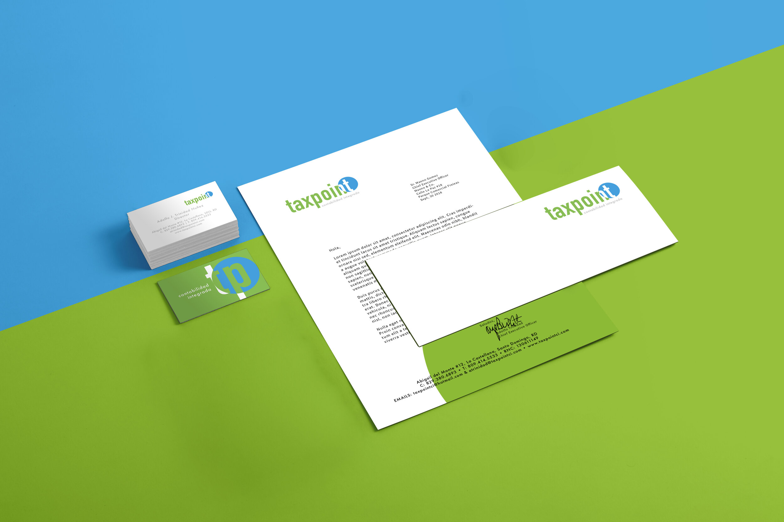
FINAL DESIGNS | BEFORE & AFTER
While the client didn’t select my #1 recommendation, they selected my second and I am happy with the overall results of the rebrand.
The new identity meets the brief in every aspect and was implemented immediately by the business. It is still being used sucessfully.