


ilumel Brand Refresh
Client: ilumel
ROLE
Brand Designer
TOOLS
Adobe Photoshop, Illustrator, After Effects
LENGTH
1 Month
PROJECT
ILUMEL is a home decor store with four decades of history, one of the largest and most prestigious retailers of furniture, lighting and decorative accessories in Latin America.
Their mission is to offer their customers a home décor experience that is unique in the world, with a total commitment to creativity, product selection, quality, attention to detail, service, and the best prices.
The main store is in Santo Domingo, and possesses nearly 20,000 square meters of showroom space.
Recently they went through a re-organization of their inner structure. This included new signage, a new facade, a new café and lounge area and an Outlet storage facility to sell discounted pieces.
For this new structure they needed a more elegant look to reflect the true premium nature of the brand. They only wanted to refresh and not a new identity as they felt they had excellent presence on the market and didn't think a completely new identity would benefit them.
ILUMEL and Maeno & Co. both re-branded at the same time, and for the same goal (a more luxurious look) these are before and after shots of presentation slides to show the contrast in both brands as they work together often.


ILUMEL lacked a certain elegance essential to a store of that level of luxury.
The main color, was a bright red that relates to "sales" or "discounts" mostly used for fast food, therefore, the color change was needed as well to take the new brand to a more elegant level.
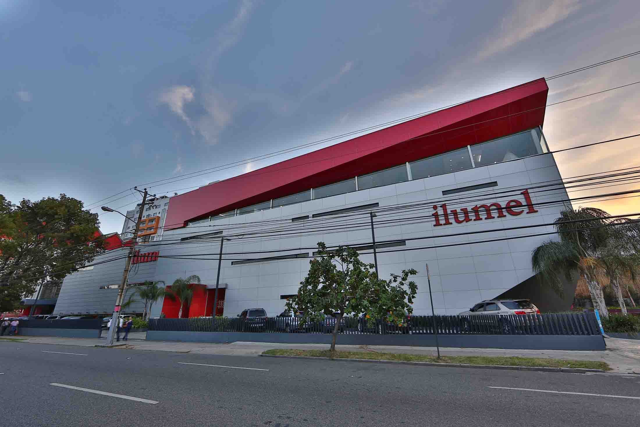
The old logo used to be encased at all times in a red square that made it look like a sticker within any piece. It made it stand out but not necessarily in a great way.
The new logo translates that square into thickness in the typography. This new logo can be very versatile and can be used on many different backgrounds without losing legibility.


The color system was developed in order to more clearly mark the areas and styles sold within the store and to more easily organize it. Both the colors and textures are useful in order to identify each style within the store using signage and tags.
Silver for the main brand, gold for classic, blue for modern, green for exteriors and terracotta for rustic styles.
MAIN BRAND
CLASSIC
MODERN
EXTERIORS
RUSTIC
The new logo has been adapted to expand the brand according to the new needs, like the new café and lounge area.


The branch in the beach resort area of Punta Cana, has approximately 6,000 square meters of showroom space. Both stores have become important landmarks in the Dominican Republic, not only on a commercial level, but also in terms of architectural and urbanistic innovation.

The Outlet needed to keep some of the elegance of the main store but save expenses in terms of printed materials and be easily translated into stamps.
For this we developed a black and white identity intended to be used in one color only.