ANIMAL CROSSING NEW HORIZONS - UX & UI DESIGN
This project focuses on UX/UI for video games. I explored UX/UI improvements for Animal Crossing New Horizons, emphasizing creativity, inclusivity, and accessibility.
Disclaimer: All visual elements are either re-created, downloaded, AI generated or screen-grabbed from the original game. Everything I used in this project was for learning and exploring purposes. All credits go to the creators of Animal Crossing New Horizons.
ROLES
UX Designer, UI Designer, UX Researcher
TOOLS
Illustrator, After Effects, Photoshop, Figma, MidJourney, Maze.com
LENGTH
8 weeks
CHALLENGE
Animal Crossing New Horizons is a fairly simple and well designed game as is. I challenged myself to try and find things to improve.
PAIN POINTS
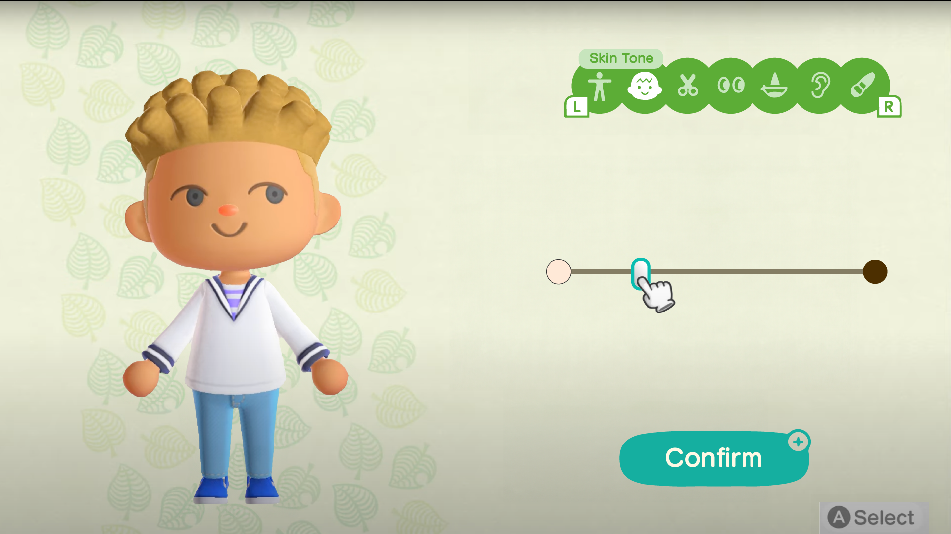
The game restricts creativity in favor of simplicity. Offering options for players that want more creativity doesn’t hurt UX for the rest of the players. Additionally, the options provided weren’t inclusive to people of all skin-tones, hair types, and body types.
WORK PROCESS
PLAYER PROFILE
I conducted a survey from people who play Animal Crossing (dedicated and brief players) to develop a player profile and begin my research.
I found common patterns between player types, and discovered a shared desire for more customization options. The majority of POC respondents found the avatar options limited.
The game could attract and retain players through more robust and inclusive avatar options.
Gaming is an intertextual medium (see Minecraft recreations), and Animal Crossing could easily tap into adjacent fandoms to build their player base.
Animal Crossing is known for its creaive options around clothes and furniture, but the game did not extend that spirit of customization to the player island.
INSIGHTS
PLAYER JOURNEY
The player journey let me identify opportunities to solve the pain points I had outlined. The opportunities I chose to solve the problems were:
Give players a wider range of natural skin and hair color / textures as well as body shape and height.
When selecting the island there was no layout freedom. My idea is to allow players to create their own layout.
The entire time the player is asking what is possible? How can I plan ahead to get the creative vision I want? When can I do X or Y thing? This prompted me to seek a solution in an inspiration board to address uncertainties.
PAPER PROTOTYPE
The paper prototype allowed me to organize the opportunities from the Player Journey into steps and decide how many screens I needed for each as well as how much information / options I needed per screen.
FLOWCHART
I took the results of the Paper Prototype and created a Flowchart that had each screen and option within it connected to the next step.
INITIAL WIREFRAMES
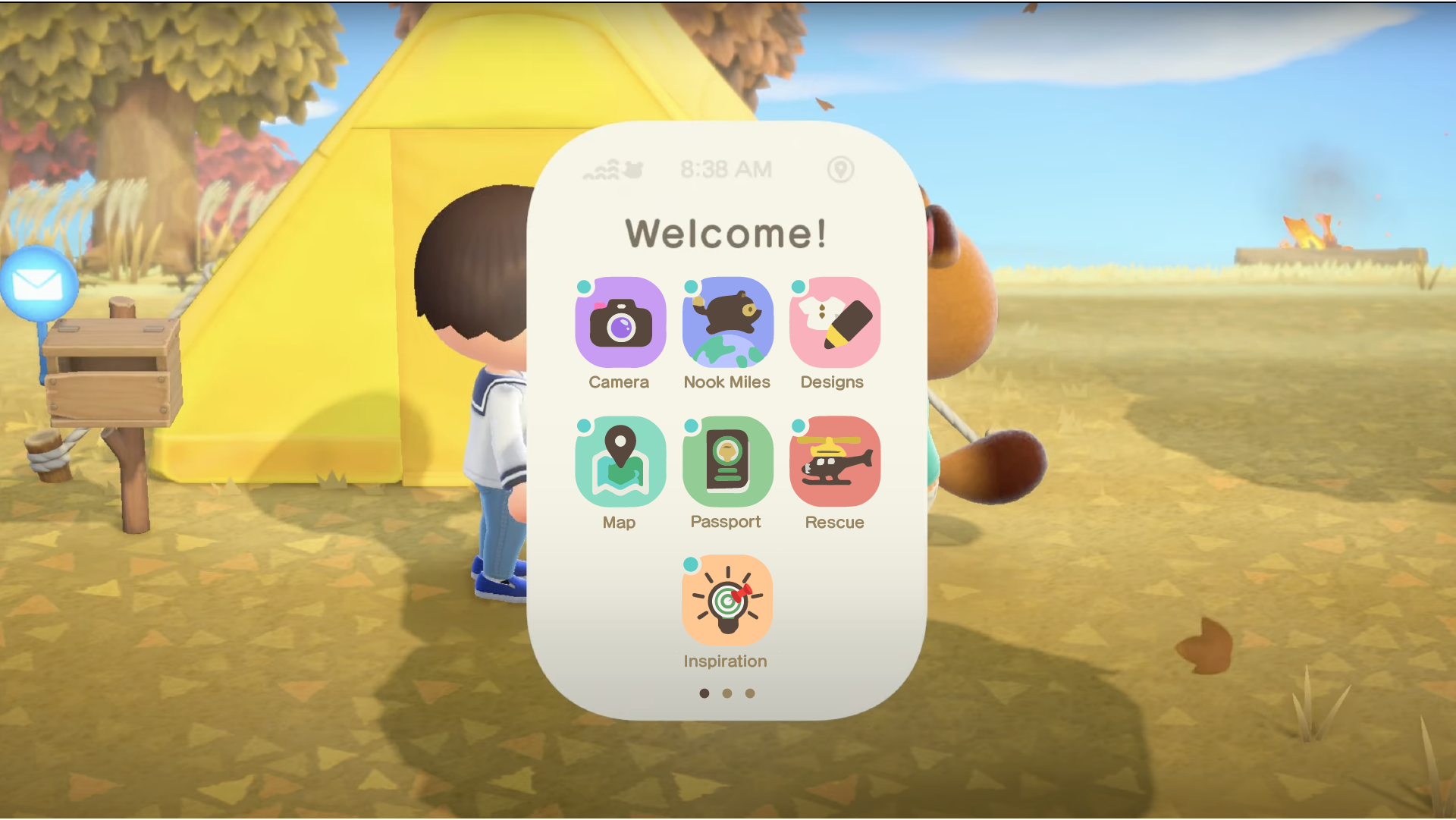
I created initial wireframes from the screens in the flowchart. They allowed me to determine the scale and placement of my options. Because I wasn’t changing the art style, I leaned on existing assets from the game. I highlighted all the interactive options in color.
USABILITY TEST
Following the initial wireframes I tested all my screens with players from my target audience. I used two formats, a live interview where I watched users playtest my prototype and/or a link to a Maze prototype and reading the subsequent data report.
As the first step to my tests I did some planning to determine what I wanted to learn from these tests and what questions I wanted to ask.
UI MOODBOARD
UI STYLE GUIDE
UI MOCKUPS
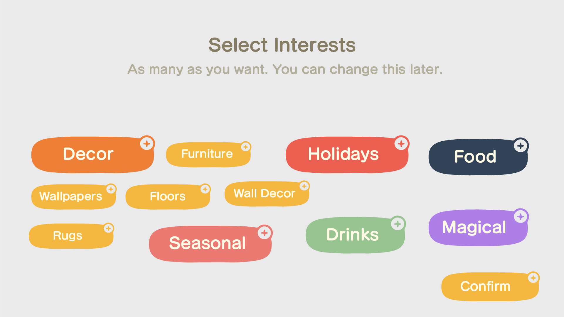
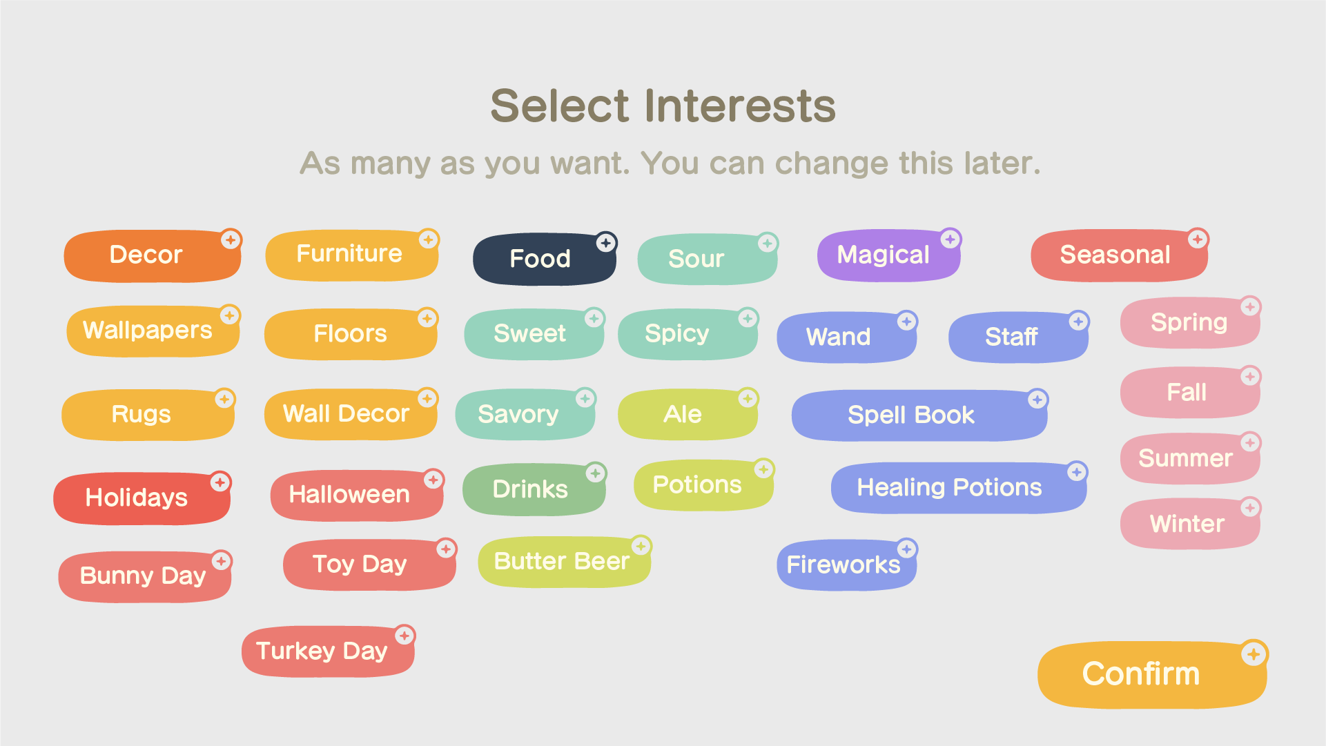
I made design modifications based on the insights from the usability test. After I was happy with the look, I started refining the art and adding colors and specific shapes. I used the game's existing art style as a foundation for my new assets so everything would feel seamlessly integrated.
ACCESSIBILITY CHECK
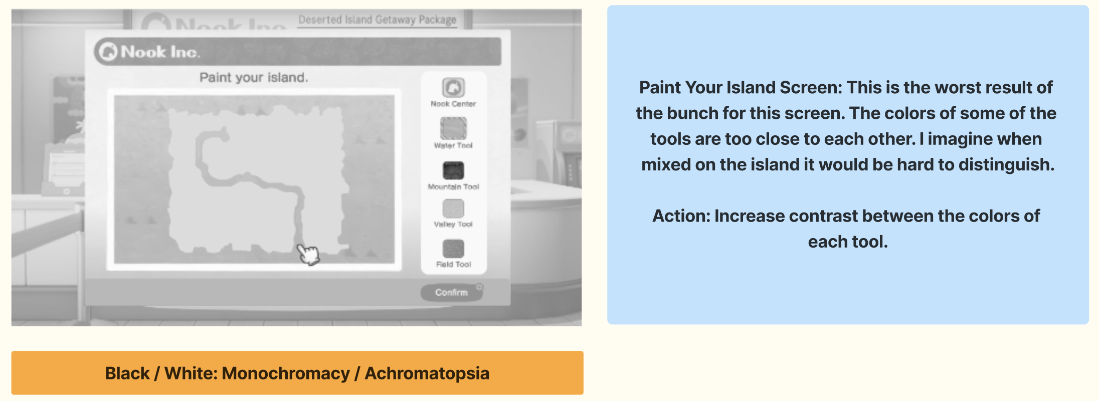
My screens underwent one final test. Accessibility! I used a color blindness simulator to check my designs against various types of color blindness. Below are the screens that needed adjusting as a result of the simulator


FINAL DESIGNS
I made changes to my designs (mostly on contrast and color) and added a little more detail to specific shapes.
OUTCOMES
I tested my final screens with the same users to verify the difference between my first screens and the finals ones. For this I used maze.com so I could collect the data after and compare.
Final screens tested positively:
100% agreed the skip option was necessary
45% appreciated avatar creation options
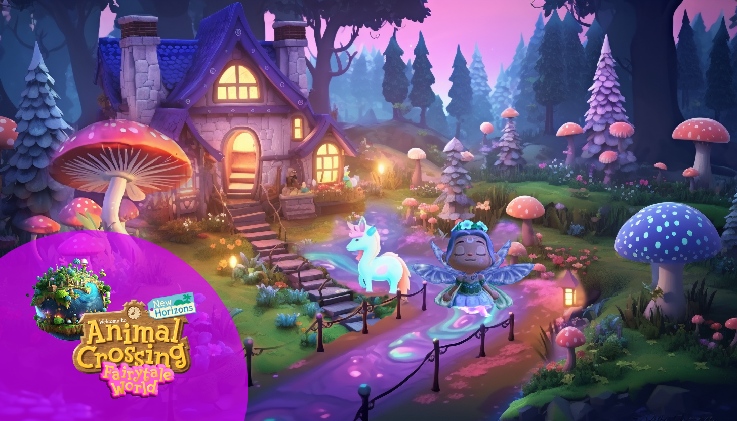
90% embraced the idea of different fantasy worlds.
REFLECTION
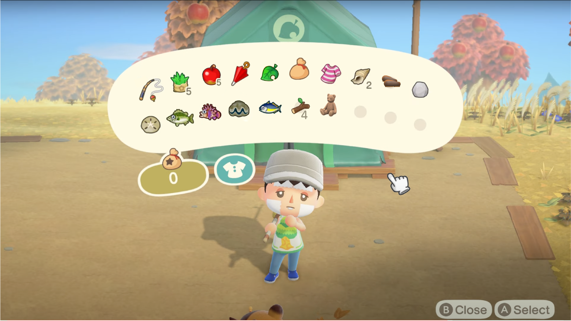
The game in its current form keeps creativity behind a gate. It allows for more creativity as the players advance in levels. However, they must work around the existing items in order to create their vision rather than making up their own. They also have no idea what or how long it will take to get there which can be frustrating.
I understand the idea of keeping “cooler” items and options for later levels and for pay in order to incentivize purchases and player retention BUT natural skin tones, hair and body types should not be on that list. These are basic and important elements of people’s identity and should be offered as the basic option.
While I improved inclusivity, I believe it can be pushed even further, by testing with a wider variety of people of different identities.
I enjoyed trying to find things to improve in a game that is simple and well designed.


