

SQUID GAME: THE TRIALS EXPERIENCE
Client: Netflix
ROLES
UX, UI, Graphic, Sound & Game Designer, Motion Graphics, Art Direction.
TOOLS
Illustrator, Photoshop, Adobe XD, After Effects, Unity
LENGTH
7 Months
COLLABORATORS
I collaborated with the Future Colossal Delivery, Physical and Creative Technology Teams, the Superfly Production Team & the Netflix Experiential Production Team. The designs shown in this case study were made by me unless stated otherwise. I did not play a part in the physical elements or fabrication.
PROJECT
A physical immersive experience that brings the Squid Game world to the fans who get to experience the trials first hand.


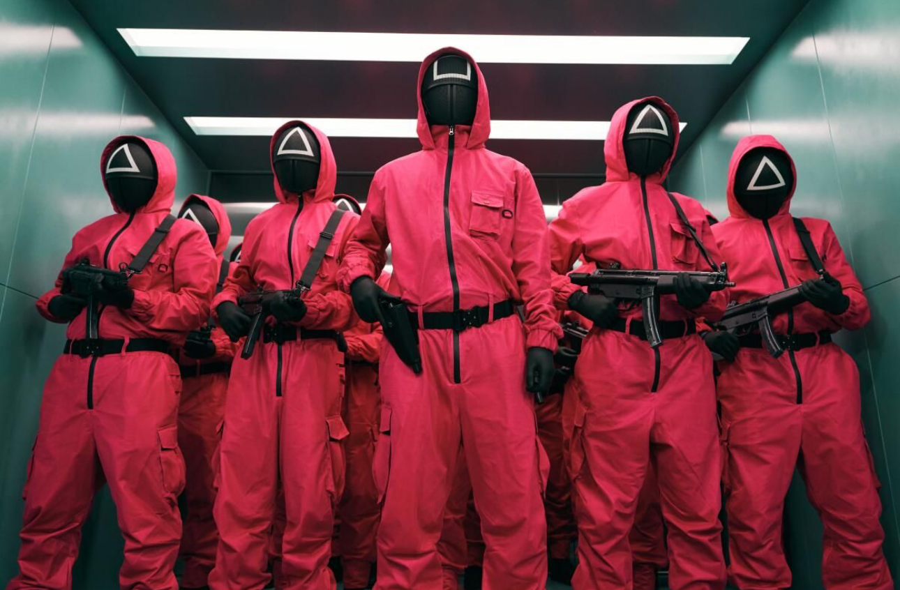
The Brand Ambassadors and Experience Coordinators dressed as Squid Game guards.
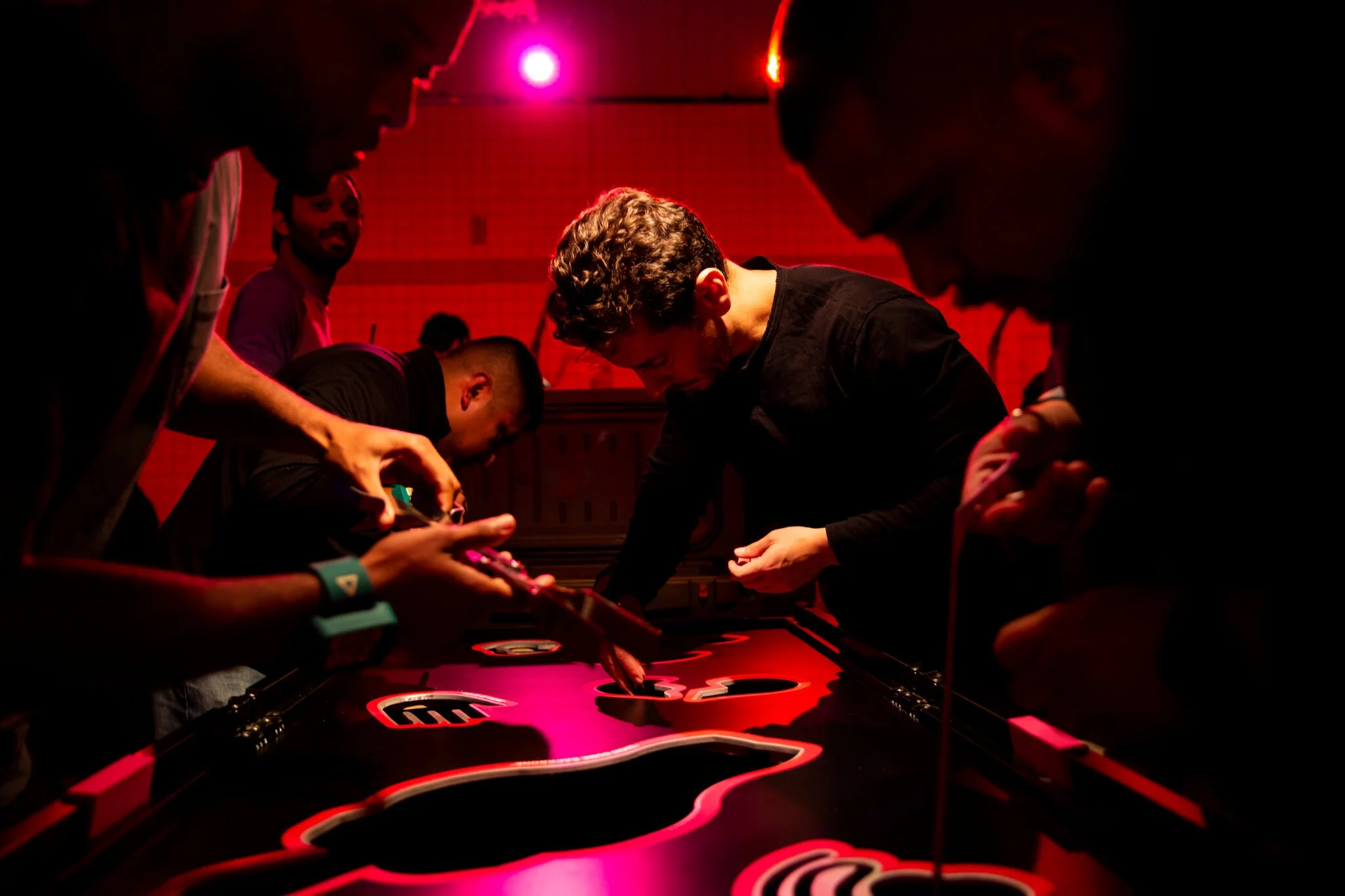
Players in the Harvest game.

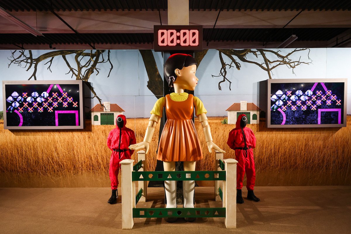
Red Light Green Light Game, interactive doll and timer.
Red Light Green Light Game, leaderboard and timer. Only the leaderboard and timer typography were designed by me.

Memory steps game.
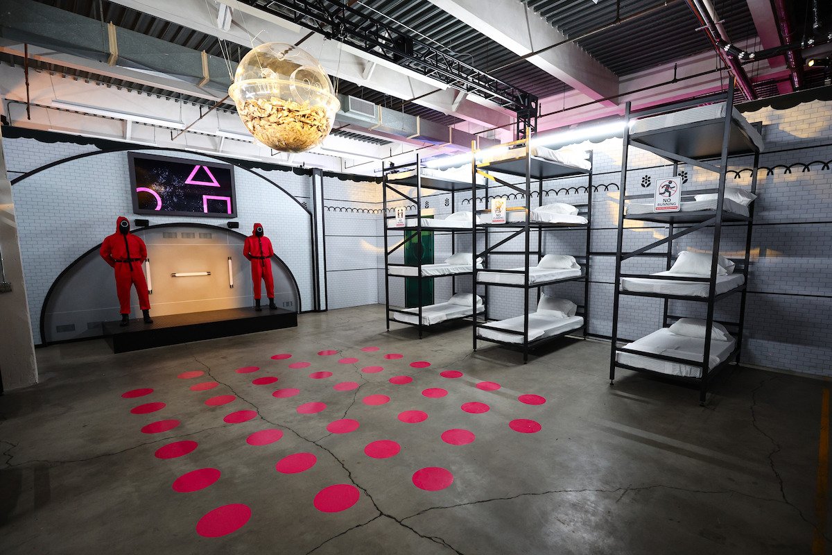
Introduction or Bunk Room. Only the screen graphics in this image were designed by me.
Netflix wanted an immersive experience themed around their Squid Game IP ahead of the show’s second season.
Games and activities needed to be fun but safe and friendly to a wide audience.
Netflix wanted to maintain brand integrity even when the “event” games differed from the show.
UX encompassed the client side experience but also the staff experience. Designing effective applications that helped manage processes and experience controls was a large portion of the work.
OVERVIEW
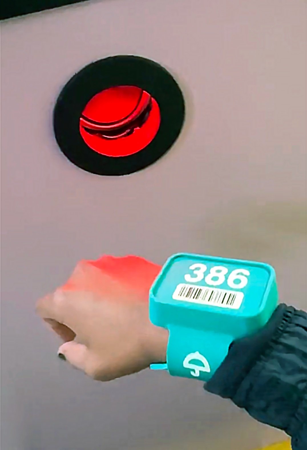
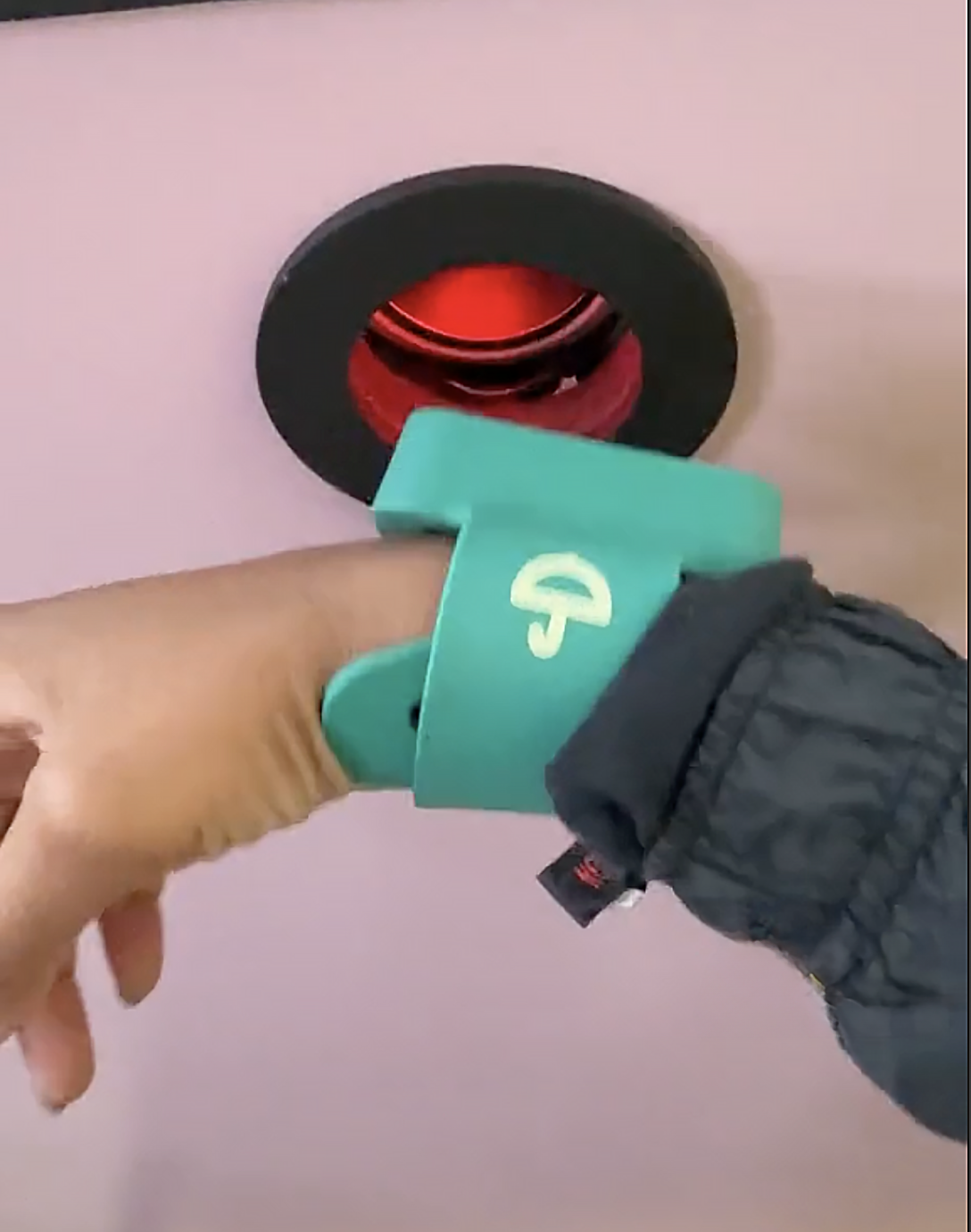
Before entering the world of Squid Game, guests shed their human identities and received a number ID bracelet (positional tracking device), enabling them to enter as a mere number on a leaderboard. After greeting the iconic Front Man, guests faced escalating challenges, accumulating points as they advanced.
EXPERIENCE

Squid Game: The Trials employed cutting-edge technology for automated gameplay to create a never-before-seen experience. Real-Time Location System (RTLS) tags in player wristbands enabled seamless competition for up to 40 players. The backend system, tracking players' locations and actions, ensured instant score updates as they progressed through different games.
INNOVATION

ONBOARDING


Real Time Location System
Visitors navigated the Night Market to receive their ID tracking band and number. These bands are registered in a complex back-end system that links a shape, an ID number and a tag which can be removed and exchanged if damaged.
Queue Application
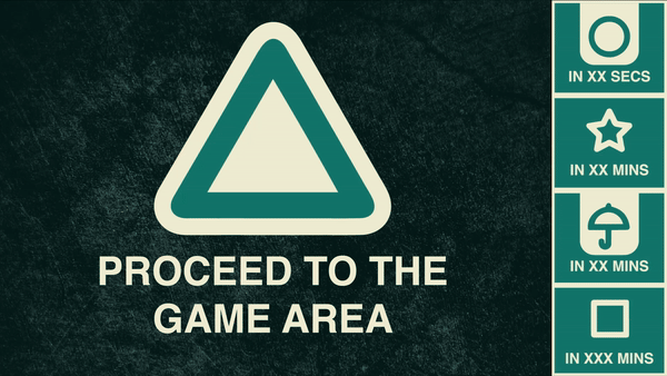
BAs (guards) schedule groups using the Queue Application which sends out vibrations to the participating players when their time slot has arrived. This application is part of a complex back-end system that includes the RTLS among other score and group tracking.
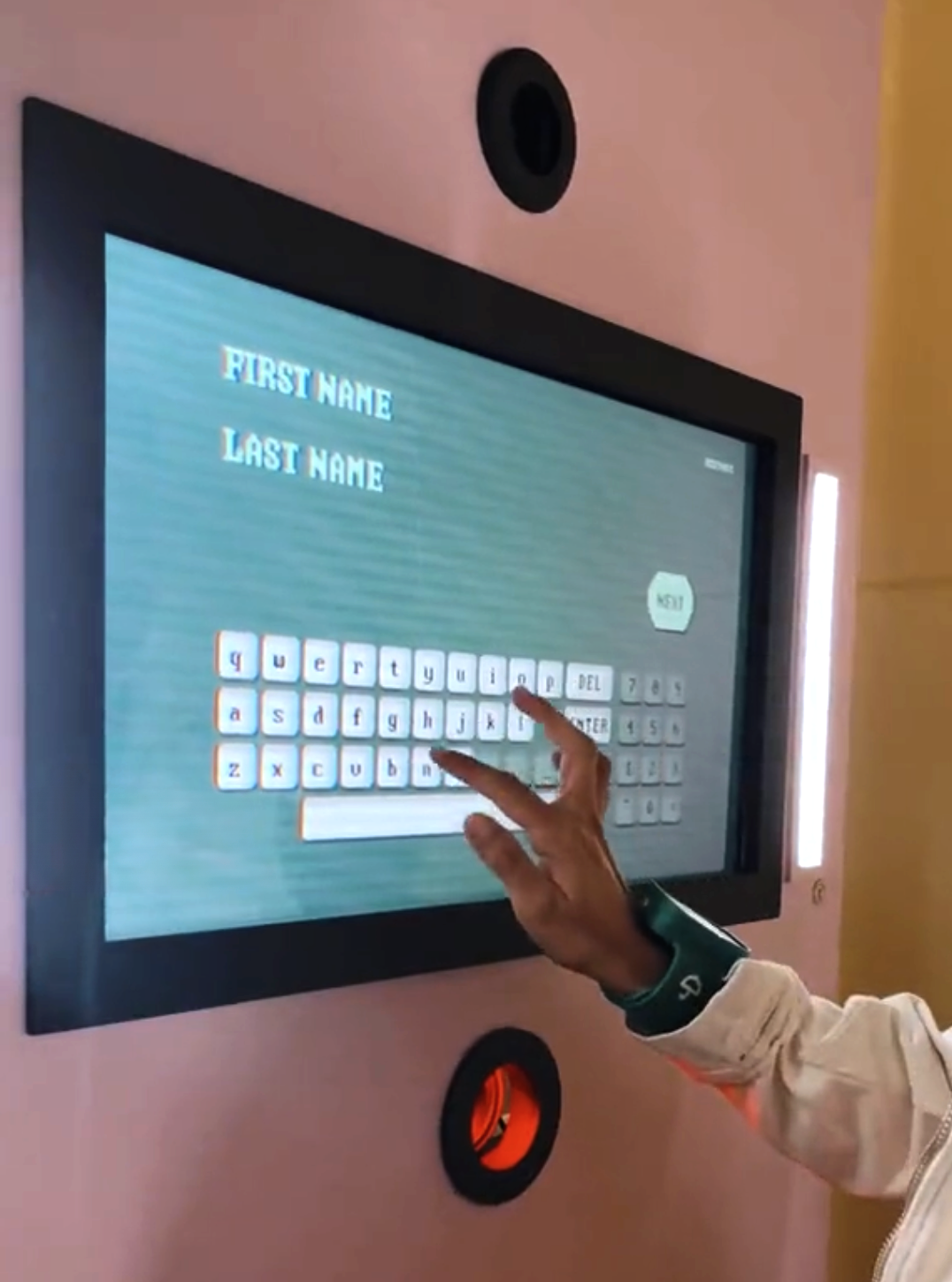
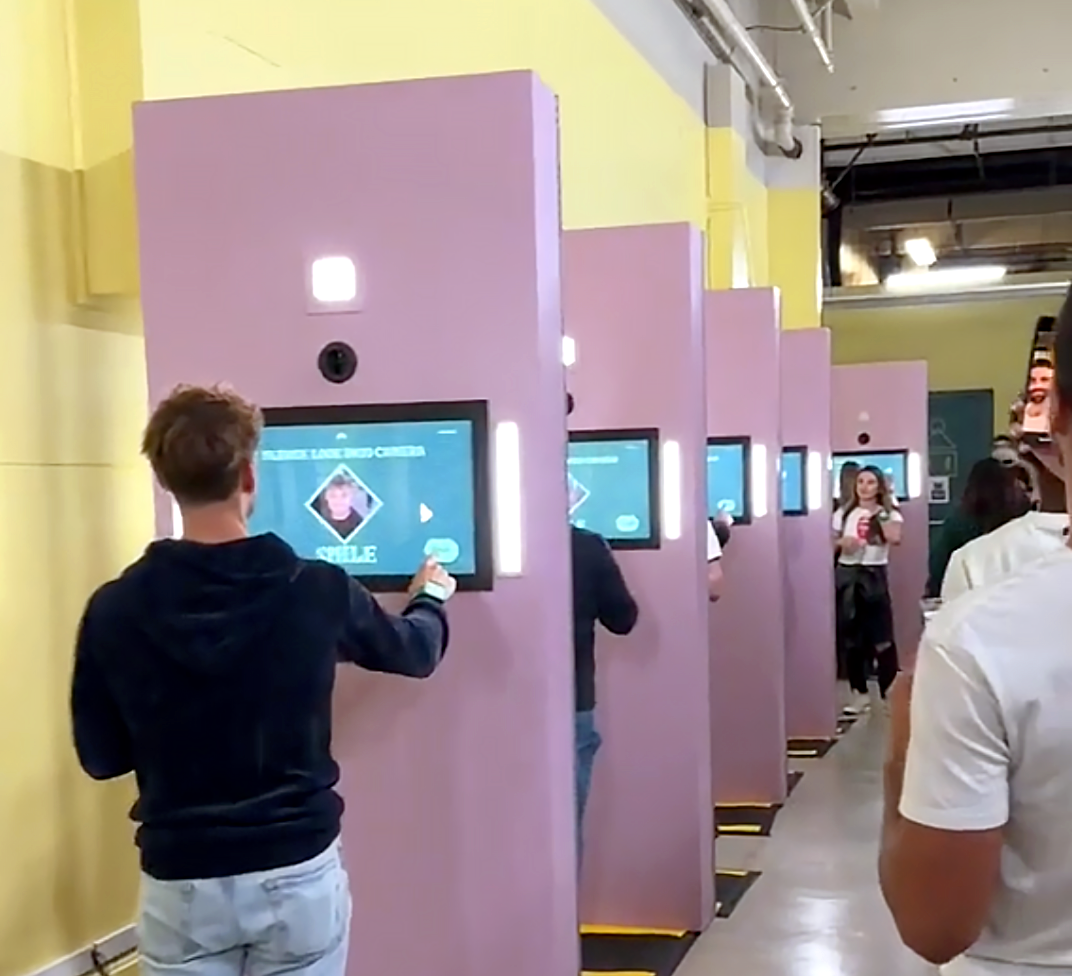
Registration Application
After receiving their band and their group is called, visitors enter the registration room and use the Registration Application housed within the interactive kiosks to sign wavers, give their names and take their picture which will be used on the leaderboard and links the player to the tag. This process enters the player in the back-end system and allows us to track them and their game scores.
Leaderboard
As players enter the first room, their photo, ID# and points populate the leaderboard on screen.
QUEUE APPLICATION
The Queue App design required two screens. One that displayed the controls for the BAs and allowed them to schedule and manage groups.
Another that simply relied the information to the guests about which group was next and whose turn it is currently.
The most challenging part of the UX was designing the queue behavior when the client required control over every detail of timing. What happens to the other groups in the queue if one adds or subtracts minutes, pauses the timer or changes the length of the time blocks?


REGISTRATION APPLICATION
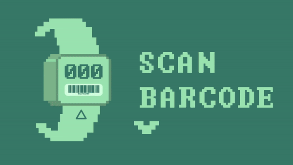
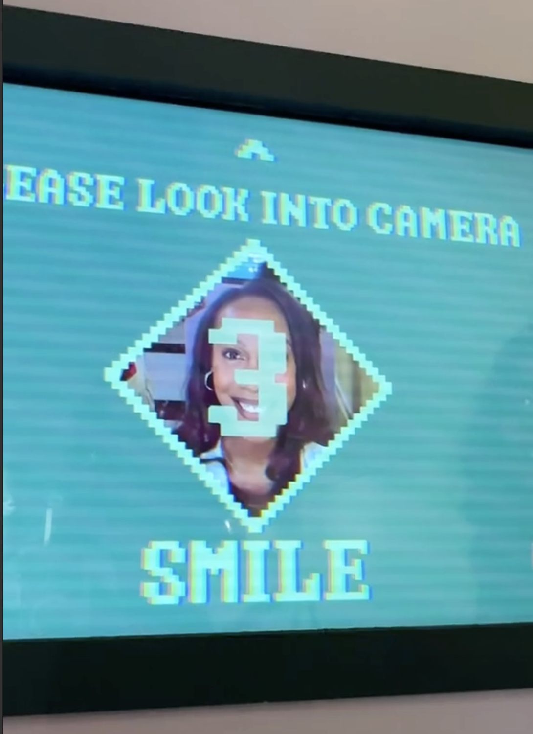
The design for the registration app is heavily inspired by the photo-taking scene in the show. The screen is monochromatic in all greens, the graphics replicate the low-res, pixelated look of the show’s smiley face screen (which also makes an appearance).
The graphics have a CRT effect overlaid on top to make the look more grungy and realistic.


The normal UX flow of the registration app. The player scans the band without issue, accepts legal and takes their picture.
The irregular/alternative UX flow for the registration app. The BA enters the band number manually, the player attempts to decline legal and the player skips the photo.

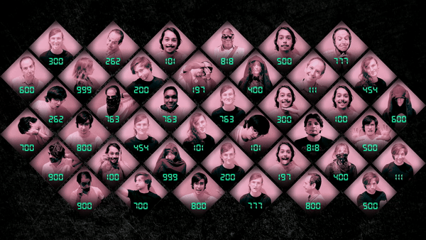
LEADERBOARD
The challenge: I needed to convey much more information while remaining as faithful to the show’s design as possible.
In the show one was either alive or dead (binary) with a number. In our experience there are ranks, informed by the amount of points, a photo and a number.


I kept the same diamond grid as in the show as well as the same photo and number treatment.
For the added information, a pink banner at the bottom two sides of the diamonds allow to showcase the rank and the points for each player.
This information is only displayed in transition rooms when the players have time to look at their progress. It is eliminated during games so as to not distract from the task at hand.
A thin black line separates the banner from the rest of the cell. Because the cell would be viewed at a much smaller scale, the line serves as a delicate division to help the eye distinguish between the graphics and the photos.

In game, if a player is eliminated, their image is highlighted by enlarging it and bringing it forward.

After, the image gets a dark overlay and a red X to mark elimination.

Then the image returns to its spot on the grid.
Elimination sequence

Cell population sequence for the minimum of 12 players.

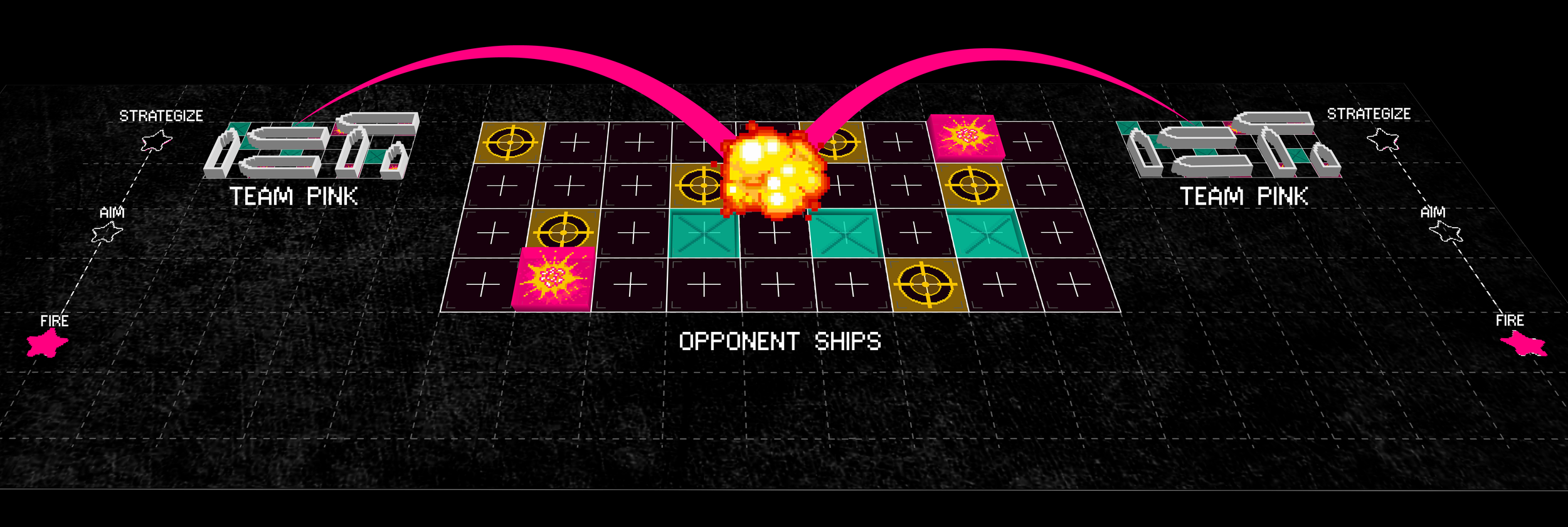
WARSHIPS
Inspired by the childhood favorite game “Battleship” this retro arcade game called WARSHIPS takes the fun to new depths.
Following the show’s retro vibes, I leaned on 8-bit arcade graphics to develop a unique visual style that manages to illustrate that dichotomy of violence vs naive childishness that is so present throughout the show.
To create a two-team digital game that incorporates elements from the game Battleship and the show, as well as environmental effects like spotlights, seat rumblers, surround sound and physical controls.
The game UI needed to fit and look good on a 33’ long projection area that is being viewed at 4’ away as the closest distance.
CHALLENGE
MOODBOARD

I combined elements from the show’s brand such as color palettes, smiley faces, and shapes. From vintage arcade games, I borrowed the 8bit aesthetic that also matches the registration app which was inspired by the photo taking scene in the show.
To solve for the challenge of incorporating all the environmental and physical controls with the digital game I divided the game into six separate phases. This allowed me to create six distinct environments or states that can loop over and over for each round.
States: Start, Intro, Strategize, Aim, Fire, and Resolution
Each state of the game is associated with specific DMX light animations, motion graphics, physical control interaction or re-action.
IDEATION
GAME STATES


The interface for this game involves a physical interface for input and a digital interface for output / reactions that is complemented by the physical interface.
The players sit in their ships and select their cells using a keyboard that is one-to-one with the center grid (9 columns and 4 rows). After selection and resolution the keyboard lights up to indicate cell states (yellow = selected, teal = missed, pink = hit).
The digital interface is the same for both teams with slight color changes for each. These are shown on large screens that are back-to-back facing each team. See below the breakdown of elements.
UI & GAME GRAPHICS

Participants enter a room flooded with vapor sodium lights, which leech the colors out of everything, making distinguishing colors impossible.
Participants pick their teams by standing in front of one of the lifesavers on the walls. Usually, they try standing close to their friends.
When the regular lights come on, players realize that they’re divided by colors they couldn’t see before, which determines their team.
START
After participants get seated in their war ships, the rules of the game and instructions play on the screen. Since they now know how to play…. it’s time to strategize….
INTRO


When the home team shoots at their selected targets, the missiles leave the boat from the side grids to meet on the selected cell, which explodes or splashes depending on hit or miss.

When the enemy team is on the attack, the missiles enter the screens from the top (the direction where the enemy team sits) and hits the correct home team boats on each side.

Full-screen takeover motion graphics when a ship on the home team is hit.

Full-screen takeover motion graphics when a ship on the home team is fully destroyed and out of the game.

Full-screen takeover motion graphics when an enemy ship is fully destroyed and out of the game.

Full-screen takeover motion graphics at the end of the game if the teal team wins.

Full-screen takeover motion graphics at the end of the game if the pink team wins.

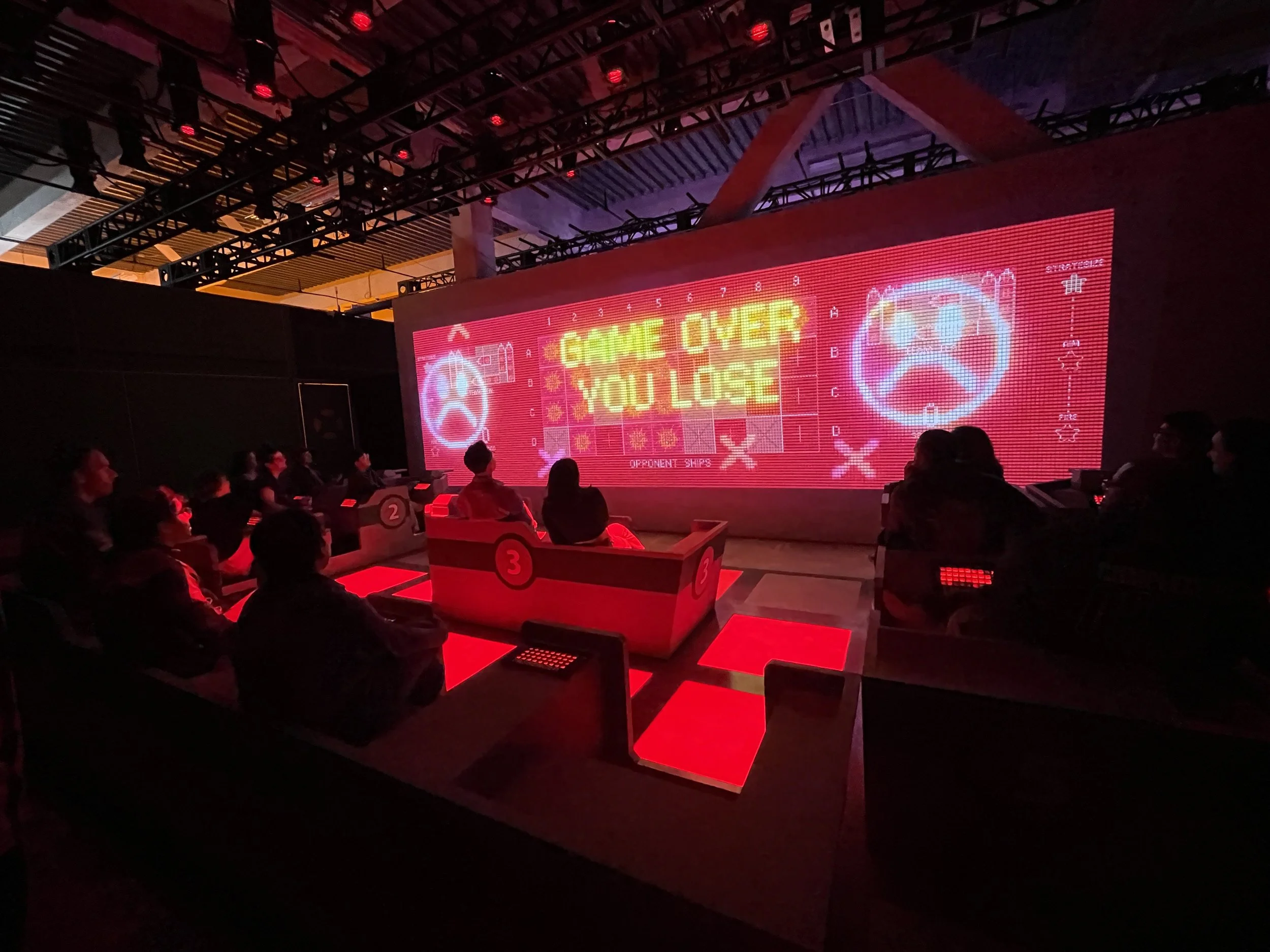
Full-screen takeover motion graphics at the end of the game for the losing team.

Full-screen takeover motion graphics for the rare event of a draw. Would appear on both screens.


CONCLUSION
The experience launched successfully in Los Angeles on December 6th 2023 and is on-going. Within a few months the experience will travel to New York City. It will continue touring to several major cities.


